I couldn’t be prouder of “Queueing Theory on a Cocktail Napkin,” this lecture I gave at Antithesis in DC on June 10.
When I started to apply just a little queueing theory, it absolutely revolutionized my practice. If you’re responsible for the health of a software service, watch this talk.
Over a decade ago, I saw this talk by John Rauser. Only recently, though, did I come to realize how incredibly influential this talk has been on my career. Gosh what a great talk! You should watch it.
If you operate a complex system, like a SaaS app, you probably have a dashboard showing a few high-level metrics that summarize the system’s overall state. These metrics (“summary statistics”) are essential. They can reveal many kinds of gross changes (both gross “large scale” and gross “ick”) in the system’s state, over many different time scales. Very useful!
But don’t be misled. Summary statistics reveal certain patterns in the system’s behavior, but they are not identical to the system’s behavior. All summary statistics – yes, even distributions – hide information. They’re lossy. It’s easy to get lulled into the sense that, if an anomaly doesn’t show up in the summary statistics, it doesn’t matter. But a complex system’s behavior is not just curves on a plot. It’s a frothing, many-dimensional vector sum of instant-to-instant interactions.
When you investigate an anomaly in summary statistics, you’re faced with a small number of big facts. Average latency jumped by 20% at such-and-such time. Write IOPS doubled. API server queue depth started rising at some later time. Usually, you “zoom in” from there to find patterns that might explain these changes.
When you instead investigate a specific instance of anomalous behavior, you start with a large number of small facts. A request to such-and-such an endpoint with this-and-that parameter took however many seconds and crashed on line 99 of thing_doer.rb. None of these small facts tell you anything about the system’s overall behavior: this is just a single event among millions or billions or more. But, nevertheless: these small facts can be quite illuminating if you zoom out.
First of all, this probably isn’t the only time a crash like this has ever occurred. Maybe it’s happening multiple times a day. Maybe it happened twice as often this week as it did last week. Maybe it’s happening every time a specific customer makes a specific API request. Maybe that customer is fuming.
And second of all, the reason this event caught our eye in the first place was because it was anomalous. It had some extreme characteristic. Take, for example, a request that was served with very high latency. Perhaps, in the specific anomalous case before us, that extreme latency didn’t cause a problem. But how extreme could it get before it did cause a problem? If it took 20 seconds today, could it take 30 seconds next time? When it hits 30, it’ll time out and throw an error. Or, if multiple requests like this all arrived at the same time, could they exhaust some resource and interfere with other requests?
If the only anomalies you investigate are those that show up in summary statistics, then you’ll only find problems that have already gotten bad enough to move those needles. But if you dig into specific instances of anomalous behavior – “outliers” – then you can often find problems earlier, before they become crises.
One day not long ago, as I was looking for trouble in a production system’s telemetry, I came across a puzzling phenomenon. I was examining the load balancer access logs for a particular API endpoint – an endpoint that does essentially nothing and should always return a 200 response within a handful of milliseconds. I saw this:
Metric
Value
My reaction
10th percentile latency
10ms
Okay,
Median latency
11ms
sure,
75th pecentile latency
14ms
fair enough,
90th percentile latency
160ms
mm-h– wait,
99th percentile latency
700ms
What??
“What gives?” I wondered aloud, cocking my head. “What could this request possibly be doing for 700 milliseconds? It has nothing to do.” That’s how I learned about an issue I’m calling upstream-local queueing. It’s a mostly stack-agnostic performance problem, and boy am I glad I found it early, because it has some dire scaling implications.
The problem
I’ll spare you a recapitulation of the head-scratching and data fumbling that ensued. Upstream-local queueing is when an upstream – an individual server tasked with responding to requests – is asked to handle more requests than it can handle concurrently. For example, suppose you have a cluster of load balancers, all of which independently distribute requests to upstreams. Each upstream has a maximum concurrency of 3.
Upstream-local queueing happens when, due to random chance, a particular upstream has 3 requests in flight, and happens to receive a 4th. The upstream can’t immediately start processing that 4th request, so it waits in a queue until some capacity frees up. And in the meantime, maybe a 5th request arrives. And so on.
So, even though the rest of the upstream cluster might have plenty of idle capacity available, these requests end up sitting around twiddling their thumbs, accumulating latency.
You’ll notice that I haven’t mentioned any particular technologies or load balancing algorithms yet. That’s because upstream-local queueing is a remarkably general phenomenon. The following system characteristics are sufficient for this problem to emerge:
The upstreams have finite capacity to handle concurrent requests.
The load balancer’s decisions about where to send each request are independent from each other.
Many systems satisfy these criteria.
It’s hard to observe
Upstream-local queueing can be tricky to observe directly. A queue can appear and disappear on any given upstream within a matter of milliseconds: far shorter than the time scales on which metrics tend to be collected. ULQ’s contribution to request latency therefore appears to be randomly distributed, and mostly 0.
Furthermore, at least in my case, the stack is not instrumented well for this. Upstream-local queueing occurs in somewhat of a black box. It’s an open-source black box, but due to the design of the component that’s handling these requests within the upstream, it’s non-trivial to observe the impact of ULQ.
Further furthermore, the severity of ULQ-caused latency is coupled to utilization, which in most real-world systems is constantly changing. And, furthestmore, unless you’re already in deep trouble, ULQ’s impact tends to be below the noise floor for all but the most painstaking measurement techniques.
The most painstaking measurement techniques
When I first set out to examine the upstream-local queueing phenomenon, I took a highly manual approach:
Pick an upstream
Search for load balancer access logs corresponding to requests that were sent to that upstream
Dump a CSV of those log entries
Run a script against the CSV that uses the timestamps and durations to reconstruct the number of requests in-flight to that upstream from instant to instant.
This was a pain in the ass. But I only had to do it 2 or 3 times before I determined that, yes: this was indeed happening, and it was causing nontrivial latency.
At this point, I was sure that I had found a big problem. But I couldn’t just go fix it. I needed to convince my colleagues. In spite of this problem’s recalcitrance to direct observation, I needed a clear and compelling demonstration.
A computational model
Lucky for me, queueing systems are easy to model!
I spent a day or two building a computational model of the behavior of an upstream under load. The model is on my GitHub. I won’t bore you with the details, but essentially, requests arrive at the upstream at a set interval, and each request takes a random amount of time to execute. If there are more than 12 requests in flight, further requests are queued until slots free up. We add up the number of microseconds spent queued versus in flight, and voilà: a working model that largely agrees with our real-world observations.
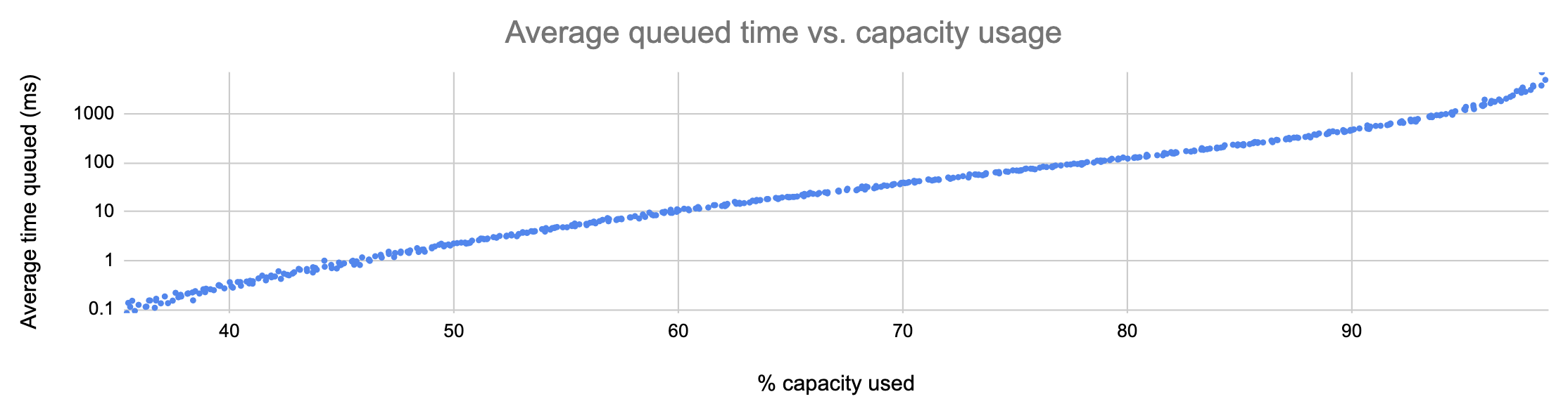
Here’s what the model told me:
In the graph above, each point represents a run of the simulation with a different average request rate. As you can see, the average number of milliseconds spent by requests in the upstream-local queue is tightly correlated to utilization, and it grows more or less exponentially.
This is a huge problem! As more capacity is used, requests experience, on average, exponentially more latency:
% capacity used
Average latency due to ULQ
40%
0.29ms
50%
2.22ms
60%
11.4ms
70%
38.4ms
80%
127ms
90%
461ms
95%
1372ms
And remember: this is just on average. 90th- and 99th-percentile latencies can climb to unacceptable levels far sooner.
What’s worse, ULQ affects all requests equally. If the average added latency is, say, 10ms, then a request that would normally take 1000ms will instead take 1010ms, for a slowdown of 1%. But a request that would normally take 5ms will take on average 15ms: a 300% performance hit. This means more requests sitting around in your stack eating up resources for no good reason. It also means, if clients of your service tend to do many individual requests in sequence (like a web browser, for example), that overall user experience can suffer drastically before this problem even appears that bad.
What to do about it
As I said before, this is a quite general problem. Switching web servers won’t fix it, nor will scaling up. Switching from random-number to round-robin load balancing, or vice versa, will not fix it. There are 3 classes of solution.
The first class of solution is the dumbest. But hey, maybe you need your upstream-local queueing problem fixed now and you don’t have time to be smart. In this case, here’s what you do: set a threshold, and meet it by keeping enough of your capacity idle. Referring to the table above, if we decided on a threshold of 11ms average ULQ latency, then we’d need to keep at least 40% of our capacity idle at all times.
I told you it was dumb. But it is easy. The other two solutions are less easy.
The second solution is to reduce your application’s latency variance. If some requests take 10 milliseconds and others take 30000, then upstream-local queueing rears its ugly head. If, instead, all your requests take between 30 and 35 milliseconds (or between 3 and 3.5 seconds, for that matter), its effect is much less pronounced. By hacking away at the long tail of your latency distribution, you may be able to push the worst effects of ULQ further to the right-hand-side of the graph. But, at the end of the day, exponential growth is exponential growth. It’s not really a fix.
The best thing you can do, of course, is use a more sophisticated load balancing algorithm. This necessitates that your load balancing software supports one. If, for example, you use a least outstanding requests algorithm, then upstream-local queueing simply won’t occur until you’ve exhausted all of your upstream capacity. It ceases to be a scaling problem.
How to tell how bad ULQ is in your stack
For a quick and dirty answer to the question “How much latency is ULQ contributing in my system?” you can make a simple graph dashboard. Take the 90th percentile latency as measured by the load balancer, and subtract the 90th percentile latency as measured by the upstream.
If these curves grow and shrink along with your throughput, you probably have an upstream-local queueing problem. And if the peaks are getting higher, that problem is getting worse.
The numbers resulting from this calculation are not a rigorous measurement of anything in particular. You can’t really add or subtract percentiles. But it’s often a very easy calculation to do, and as long as you don’t make inferences based on the values of the numbers – just the shapes of the curves – you can get some quick confidence this way before you proceed with a deeper investigation. And then you can fix it.
In an organization that delivers a software service, almost all R&D time goes toward building stuff. We figure out what the customer needs, we decide how to represent their need as software, and we proceed to build that software. After we repeat this cycle enough times, we find that we’ve accidentally ended up with a complex system.
Inevitably, by virtue of its complexity, the system exhibits behaviors that we didn’t design. These behaviors are surprises, or – often – problems. Slowdowns, race conditions, crashes, and so on. Things that we, as the designers, didn’t anticipate, either because we failed to consider the full range of potential interactions between system components, or because the system was exposed to novel and unpredictable inputs (i.e. traffic patterns). Surprises emerge continuously, and most couldn’t have been predicted a priori from knowledge of the system’s design.
R&D teams, therefore, must practice 2 distinct flavors of engineering. Prescriptive engineering is when you say, “What are we going to build, and how?”, and then you execute your plan. Teams with strong prescriptive engineering capabilities can deliver high-quality features fast. And that is, of course, indispensable.
But prescriptive engineering is not enough. As surprises emerge, we need to spot them, understand them, and explain them. We need to practice descriptive engineering.
Descriptive engineering is usually an afterthought
Most engineers rarely engage with production surprises.
We’re called upon to exercise descriptive engineering only in the wake of a catastrophe or a near-catastrophe. Catastrophic events bring attention to the ways in which our expectations about the system’s behavior have fallen short. We’re asked to figure out what went wrong and make sure it doesn’t happen again. And, when that’s done, to put the issue behind us so we can get back to the real work.
In fact, descriptive engineering outside the context of a catastrophe is unheard of most places. Management tends to see all descriptive engineering as rework: a waste of time that could have been avoided had we just designed our system with more forethought in the first place.
The complexity of these systems makes it impossible for them to run without multiple flaws being present. Because these [flaws] are individually insufficient to cause failure they are regarded as minor factors during operations. … The failures change constantly because of changing technology, work organization, and efforts to eradicate failures.
A complex system’s problems are constantly shifting, recombining, and popping into and out of existence. Therefore, descriptive engineering – far from rework – is a fundamental necessity. Over time, the behavior of the system diverges more and more from our expectations. Descriptive engineering is how we bring our expectations back in line with reality.
In other words: our understanding of a complex system is subject to constant entropic decay, and descriptive engineering closes an anti-entropy feedback loop.
Where descriptive engineering lives
Descriptive engineering is the anti-entropy that keeps our shared mental model of the system from diverging too far from reality. As such, no organization would get very far without exercising some form of it.
But, since descriptive engineering effort is so often perceived as waste, it rarely develops a nucleus. Instead, it arises in a panic, proceeds in a hurry, and gets abandoned half-done. It comes in many forms, including:
handling support tickets
incident response
debugging a broken deploy
performance analysis
In sum: the contexts in which we do descriptive engineering tend to be those in which something is broken and needs to be fixed. The understanding is subservient to the fix, and once the fix is deployed, there’s no longer a need for descriptive engineering.
Moreover, since descriptive engineering usually calls for knowledge of the moment-to-moment interactions between subsystems in production, and between the overall system and the outside world, this work has a habit of being siphoned away from developers toward operators. This siphoning effect is self-reinforcing: the team that most often practices descriptive engineering will become the team with the most skill at it, so they’ll get assigned more of it.
This is a shame. By adopting the attitude that descriptive engineering need only occur in response to catastrophe, we deny ourselves opportunities to address surprises before they blow up. We’re stuck waiting for random, high-profile failures to shock us into action.
What else can we do?
Instead of doing descriptive engineering only in response to failures, we must make it an everyday practice. To quote Dr. Cook again,
Overt catastrophic failure occurs when small, apparently innocuous failures join to create opportunity for a systemic accident. Each of these small failures is necessary to cause catastrophe but only the combination is sufficient to permit failure. Put another way, there are many more failure opportunities than overt system accidents.
We won’t ever know in advance which of the many small failures latent in the system will align to create an accident. But if we cultivate an active and constant descriptive engineering practice, we can try to make smart bets and fix small problems before they align to cause big problems.
What would a proactive descriptive engineering practice look like, concretely? One can imagine it in many forms:
A dedicated team of SREs.
A permanent cross-functional team composed of engineers familiar with many different parts of the stack.
A cultural expectation that all engineers spend some amount of their time on descriptive engineering and share their results.
A permanent core team of SREs, joined by a rotating crew of other engineers. Incidentally, this describes the experimental team I’m currently leading IRL, which is called Production Engineering.
I have a strong preference for models that distribute descriptive engineering responsibility across many teams. If the raison d’être of descriptive engineering is to maintain parity between our expectations of system behavior and reality, then it makes sense to spread that activity as broadly as possible among the people whose expectations get encoded into the product.
In any case, however we organize the effort, the main activities of descriptive engineering will look much the same. We delve into the data to find surprises. We pick some of these surprises to investigate. We feed the result of our investigations back into development pipeline. And we do this over and over.
It may not always be glamorous, but it sure beats the never-ending breakdown.
Take a nontrivial software system and put it on the internet. Problems will emerge. Some problems will be serious; others less so. We won’t notice most of them.
A software system in production is a bucket filled with fluid. Each particle of the fluid is a discrete problem. The problems bounce around and collide with each other and do all kinds of stochastic stuff from moment to moment.
At the very bottom of the bucket are problems so minute that they can hardly be called problems at all. They have low energy. They don’t interact much with each other or with anything else.
Higher up, you find higher-and-higher-energy particles. Problems that cause small hiccups, or sporadic bouts of sluggishness.
Somewhere near the top, there’s a threshold. When a problem gets enough energy to cross this threshold, we passively notice it. Maybe it causes an outage, or maybe it just causes a false positive alert. Maybe a support ticket gets filed. Maybe it’s just a weird spike in a graph. However we perceive it, we’re forced to take it seriously.
Once problems get enough energy, we can’t help but notice them. But before that, they already exist.
What happens before a particle jumps this energy threshold?
Perhaps the problem is entirely novel – no part of it existed before now. A code deploy with a totally self-contained bug. A DOS attack. If it’s something like that: oh well.
But more often, a problem we just perceived has been acted upon by a more gradual process. Problems bounce around in the bucket, and occasionally they bounce into each other and you get a problem with higher energy than before. Or circumstances shift, and a problem that was once no big deal becomes a big deal. Over time, particles that started in the middle – or even at the bottom – can work their way up to the passive perception line.
If problems usually hang out below the perception threshold for a while before they cross it, then we can take advantage of that in two ways. One way is to lower the threshold for passive perception. Raise the sensitivity of our monitors without sacrificing specificity. This is hard, but worthwhile.
The other way to take advantage of the fluid-like behavior of problems is to spend energy finding and fixing problems before they boil. I call this the Maxwell’s demon approach. You go looking for trouble. You poke around in dashboards and traces and logs, find things that look weird, turn them around in your hands until you understand them, and ultimately fix them. Maybe you have a ticket backlog of possible problems you’ve found, and it’s somebody’s job to burn down that backlog. Ideally it’s the job of a team using a shared-context system like differential diagnosis.
If you make it somebody’s job to be Maxwell’s demon, you can find and fix all sorts of problems before they become bigger problems. If you don’t make it someone’s job, then no problem will get taken seriously until it’s an outage.
Imagine you’re an extremely bad doctor. Actually, chances are you don’t even have to imagine. Most people are extremely bad doctors.
I love dogs, but they make bad doctors.
But imagine you’re a bad doctor with a breathtakingly thorough knowledge of the human body. You can recite chapter and verse of your anatomy and physiology textbooks, and you’re always up to date on the most important research going on in your field. So what makes you a bad doctor? Well, you never order tests for your patients.
What good does your virtually limitless store of medical knowledge do you? None at all. Without data from real tests, you’ll almost never pick the right interventions for your patients. Every choice you make will be a guess.
There’s another way to be an extremely bad doctor, though. Imagine you don’t really know anything about how the human body works. But you do have access to lots of fancy testing equipment. When a patient comes in complaining of abdominal pain and nausea, you order as many tests as you can think of, hoping that one of them will tell you what’s up.
This rarely works. Most tests just give you a bunch of numbers. Some of those numbers may be outside of normal ranges, but without a coherent understanding of how people’s bodies behave, you have no way to put those numbers into context with each other. They’re just data – not information.
In medicine, data is useless without theory, and theory is useless without data. Why would we expect things to be any different in software?
Observability as signal and theory
The word “observability” gets thrown around a lot, especially in DevOps and SRE circles. Everybody wants to build observable systems, then make their systems more observable, and then get some observability into their observability so they can observe while they observe.
But when we look for concrete things we can do to increase observability, it almost always comes down to adding data. More metrics, more logs, more spans, more alerts. Always more. This makes us like the doctor with all the tests in the world but no bigger picture to fit their tests results into.
Observability is not just data. Observability comprises two interrelated and necessary properties: signal and theory. The relationship between these two properties is as follows:
Signal emerges from data when we interpret it within our theory about the system’s behavior.
Theory reacts to signal, changing and adapting as we use it to process new information.
In other words, you can’t have observability without both a rich vein of data and a theory within which that data can be refined into signal. Not enough data and your theory can’t do its job; not enough theory and your data is meaningless. Theory is the alchemy that turns data into knowledge.
What does this mean concretely?
It’s all well and good to have a definition of observability that looks nice on a cocktail napkin. But what can we do with it? How does this help us be better at our job?
The main takeaway from the understanding that observability consists of a relationship between data and theory, rather than simply a surfeit of the former, is this: a system’s observability may be constrained by deficiencies in either the data stream or our theory. This insight allows us to make better decisions when promoting observability.
Making better graph dashboards
However many graphs it contains, a metric dashboard only contributes to observability if its reader can interpret the curves they’re seeing within a theory of the system under study. We can facilitate this through many interventions, a few of which are to:
Add a note panel to the top of every dashboard which give an overview of how that dashboard’s graphs are expected to relate to one another.
Add links to dashboards for upstream and downstream services, so that data on the dashboard can be interpreted in a meaningful context.
When building a dashboard, start with a set of questions you want to answer about a system’s behavior, and then choose where and how to add instrumentation; not the other way around.
Making better alerts
Alerts are another form of data that we tend to care about. And like all data, they can only be transmogrified into signal by being interpreted within a theory. To guide this transmogrification, we can:
Present alerts along with links to corresponding runbooks or graph dashboards.
Document a set of alerts that, according to our theory, provides sufficient coverage of the health of the system.
Delete any alerts whose relevance to our theory can’t be explained succinctly.
Engaging in more effective incident response
When there’s an urgent issue with a system, an intuitive understanding of the system’s behavior is indispensable to the problem solving process. That means we depend on the system’s observability. The incident response team’s common ground is their theory of the system’s behavior – in order to make troubleshooting observations meaningful, that theory needs to be kept up to date with the data.
To maintain common ground over the course of incident response, we can:
Engage in a regular, structured sync conversation about the meaning of new data and the next steps.
Seek out data only when you can explicitly state how the data will relate to our theory (e.g. “I’m going to compare these new log entries with the contents of such-and-such database table because I think the latest deploy might have caused an inconsistency”).
Maintain an up-to-date, explicit record of the current state of problem solving, and treat it as the ultimate source of truth.
Delivering meaning
Data is just data until theory makes it signal.
The next time you need to build an observable system, or make a system more observable, take the time to consider not just what data the system produces, but how to surface a coherent theory of the system’s workings. Remember that observability is about delivering meaning, not just data.
Ever since the late 2000s, I’ve been implementing “alert review” processes on ops teams. As a team, we go through all the alerts we’ve received in the last week, and identify those that are bad.
But what makes an alert bad? How do we distinguish the good ones from the bad?
I use a simple framework wherein a good alert has the following properties:
Actionable:Indicates a problem for which the recipient is well placed to take immediate corrective action.
Investigable: (yes, I made this word up) Indicates a problem whose solution is not yet known by the organization.
These properties can be present or absent independently, so this framework identifies four types of alerts:
Actionability
Actionability has been widely touted as a necessary condition for good alerts, and for good reason. Why send an alert about something you can’t fix? Just to make the recipient anxious?
Referring to my definition of an actionable alert:
Indicates a problem for which the recipient is well placed to take immediate corrective action.
we can see three main ways in which non-actionability shows up:
Someone is well placed to take immediate corrective action, but not the recipient. For example, an alert that indicates a problem with the Maple Syrup service instead pages the Butter team, which can’t do anything about it. In cases like these, the fix is often simple: change the alert’s recipient. Sometimes, though, you’ll first have to refactor your config to let it distinguish between Maple Syrup problems and Butter problems.
There is an action to take, but it can’t be taken immediately. For example, Apache needs to be restarted, but the recipient of the alert isn’t sure whether this will cause an outage. This type of non-actionable alert often calls for either improved documentation (e.g. a “runbook” indicating steps to perform). Another example might be a disk space alert that has been slowly climbing for a while and just crossed a threshold: action can’t be taken immediately, because the team needs to agree upon an action to take.
There is no action to take. For example, “CPU utilization” or “Packet loss.” These are your classic FYI alerts. Instead of alerting, these things should appear on a dashboard for use in troubleshooting when a problem is already known to exist.
Investigability
An alert is non-investigable if its implications are obvious at first glance. Here are the two most common types of non-investigable alerts:
“Chief O’Brien” alerts. If you look at your phone and instantly know the commands you have to run to fix it, that’s a “Chief O’Brien” alert. There’s no need to bother a human to fix the issue; the response should be automated.
Redundant alerts. Sometimes you get an alert for increased error rates from one of your services, and by the time you get up and get to your laptop, you’ve gotten 8 more similar alerts. The first one might well have been a perfectly good alert, but the other 8 are likely non-investigable. Whatever you learn in investigating the first one will apply to the rest in exactly the same way. The correct response to alerts like these is to use dependencies or grouping.
What to do with this framework
Like I said, I like to have my team go through all the alerts they’ve received in the last week and discuss them. Imagine a spreadsheet where each alert is a row and there are columns labeled Actionable? and Investigable?
Actually, don’t bother. I imagined one for you:
This actionability/investigability framework helps the team identify bad alerts and agree on the precise nature of their badness. And as a bonus, the data in these spreadsheets can shine a light on trends in alert quality over time.
I’ve had a lot of success with this framework throughout the years, and I’d like to hear how it works for others. Let me know if you try it out, or if you have a different model for addressing the same sorts of questions!
It’s a great idea to track your MTTR (Mean Time To Recover) as an operational metric. MTTR is defined as the average interval between onset of a failure and recovery from that failure. We acknowledge that failures are part of the game, so we want our organization to be good at responding quickly to them. It’s intuitive that we’d want our MTTR to trend down.
This is one of those places where our intuition can be misleading.
MTTR is an average over incidents of incident duration. That means that the total amount of downtime gets denominatored out. Consider these two brothers who run different websites:
Achenar’s site only had 1 outage in September, and it lasted 60 minutes.
Sirius’s site had 120 outages in September, lasting 20 minutes each.
Sirius had 40 times as much downtime as Achenar in the month of September. Sirius’s MTTR, however, was 1/3 that of Achenar: 20 minutes rather than 60 minutes.
Lowering your MTTR is a good strategy in certain situations. But you need to make sure it’s the right strategy. If you don’t look at the whole picture, things like nuisance alarmsand insufficient automation can be confounded with the meaning of your MTTR. If you fix a whole bunch of meaningless alerts that always recover quickly without intervention (you know the type), your MTTR goes up!
MTTR is useful to track, and it can be useful for decision-making. Just remember: our goal is to minimize downtime and noise, not MTTR. If the path of least resistance to lower downtime and a stronger signal is to respond to incidents quicker, then MTTR is your best friend. But that’s not always true.
EDIT 2023-01-16: Since I wrote this, I’ve gotten really into what I call descriptive engineering and the Maxwell’s Demon approach. I still don’t think it’s worthwhile to try to predict novel failures automatically based on telemetry, but predicting novel failures manually based on intuition and elbow grease is super useful.
I often meet with skepticism when I say that server monitoring systems should only page when a service stops doing its work. It’s one of the suggestions I made in my Smoke Alarms & Car Alarms talk at Monitorama this year. I don’t page on high CPU usage, or rapidly-growing RAM usage, or anything like that. Skeptics usually ask some variation on:
If you only alert on things that are already broken, won’t you miss opportunities to fix things before they break?
The answer is a clear and unapologetic yes! Sometimes that will happen.
It’s easy to be certain that a service is down: just check whether its work is still getting done. It’s even pretty easy to detect a performance degradation, as long as you have clearly defined what constitutes acceptable performance. But it’s orders of magnitude more difficult to reliably predict that a service will go down soon without human intervention.
We like to operate our systems at the very edge of their capacity. This is true not only in tech, but in all sectors: from medicine to energy to transportation. And it makes sense: we bought a certain amount of capacity: why would we waste any? But a side effect of this insatiable lust for capacity is that it makes the line between working and not working extremely subtle. As Mark Burgess points out in his thought-provoking In Search of Certainty, this is a consequence of nonlinear dynamics (or “chaos theory“), and our systems are vulnerable to it as long as we operate them so close to an unstable region.
But we really really want to predict failures! It’s tempting to try and develop increasingly complex models of our nonlinear systems, aiming for perfect failure prediction. Unfortunately, since these systems are almost always operating under an unpredictable workload, we end up having to couple these models tightly to our implementation: number of threads, number of servers, network link speed, JVM heap size, and so on.
This is just like overfitting a regression in statistics: it may work incredibly well for the conditions that you sampled to build your model, but it will fail as soon as new conditions are introduced. In short, predictive models for nonlinear systems are fragile. So fragile that they’re not worth the effort to build.
Instead of trying to buck the unbuckable (which is a bucking waste of time), we should seek to capture every failure and let our system learn from it. We should make systems that are aware of their own performance and the status of their own monitors. That way we can build feedback loops and self-healing into them: a strategy that won’t crumble when the implementation or the workload takes a sharp left.
Wouldn’t you like to live in a world where your monitoring systems only alerted when things were actually broken? And wouldn’t it be great if, in that world, your alerts would always fire if things were broken?
Well so would everybody else. But we don’t live in that world. When we choose a threshold for alerting, we usually have to make a tradeoff between the chance of getting a false positive (an alert that fires when nothing is wrong) and the chance of getting a false negative (an alert that doesn’t fire when something is wrong).
Take the load average on an app server for example: if it’s above 100, then your service is probably broken. But there’s still a chance that the waiting processes aren’t blocking your mission-critical code paths. If you page somebody on this threshold, there’s always a chance that you’ll be waking that person up in the middle of the night for no good reason. However, if you raise the threshold to 200 to get rid of such spurious alerts, you’re making it more likely that a pathologically high load average will go unnoticed.
When presented with this tradeoff, the path of least resistance is to say “Let’s just keep the threshold lower. We’d rather get woken up when there’s nothing broken than sleep through a real problem.” And I can sympathize with that attitude. Undetected outages are embarrassing and harmful to your reputation. Surely it’s preferable to deal with a few late-night fire drills.
It’s a trap.
In the long run, false positives can — and will often — hurt you more than false negatives. Let’s learn about the base rate fallacy.
The base rate fallacy
Suppose you have a service that works fine most of the time, but breaks occasionally. It’s not trivial to determine whether the service is working, but you can write a probe that’ll detect its state correctly 99% of the time:
If the service is working, there’s a 1% chance that your probe will say it’s broken
If the service is broken, there’s a 1% chance that your probe will say it’s working
Naïvely, you might expect this probe to be a decent check of the service’s health. If it goes off, you’ve got a pretty good chance that the service is broken, right?
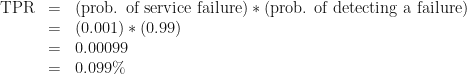
No. Bad. Wrong. This is what logicians and statisticians call the “base rate fallacy.” Your expectation hinges on the assumption that the service is only working half the time. In reality, if the service is any good, it works almost all the time. Let’s say the service is functional 99.9% of the time. If we assume the service just fails randomly the other 0.1% of the time, we can calculate the true-positive rate:
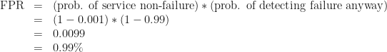
That is to say, about 1 in 1000 of all tests will run during a failure and detect that failure correctly. We can also calculate the false-positive rate:
So almost 1 test in 100 will run when the service is not broken, but will report that it’s broken anyway.
You should already be feeling anxious.
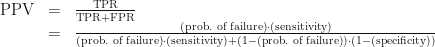
With these numbers, we can calculate what the medical field calls the probe’s positive predictive value: the probability that, if a given test produces a positive result, it’s a true positive. For our purposes this is the probability that, if we just got paged, something’s actually broken.
Bad news. There’s no hand-waving here. If you get alerted by this probe, there’s only a 9.1% chance that something’s actually wrong.
Car alarms and smoke alarms
When you hear a car alarm going off, do you run to the window and start looking for car thieves? Do you call 9-1-1? Do you even notice car alarms anymore?
Car alarms have a very low positive predictive value. They go off for so many spurious reasons: glitchy electronics, drunk people leaning on the hood, accidental pressing of the panic button. And as a result of this low PPV, car alarms are much less useful as theft deterrents than they could be.
Now think about smoke alarms. People trust smoke alarms. When a smoke alarm goes off in a school or an office building, everybody stops what they’re doing and walks outside in an orderly fashion. Why? Because when smoke alarms go off (and there’s no drill scheduled), it frequently means there’s actual smoke somewhere.
This is not to say that smoke alarms have a perfect PPV, of course, as anybody who’s lost half an hour of their time to a false positive will tell you. But their PPV is high enough that people still pay attention to them.
We should strive to make our alerts more like smoke alarms than car alarms.
Sensitivity and specificity
Let’s go back to our example: probing a service that works 99.9% of the time. There’s some jargon for the tradeoff we’re looking at. It’s the tradeoff between the sensitivity of our test (the probability of detecting a real problem if there is one) and its specificity (the probability that we won’t detect a problem if there isn’t one).
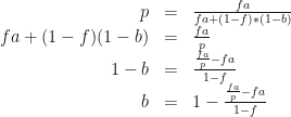
Every time we set a monitoring threshold, we have to balance sensitivity and specificity. And one of the first questions we should ask ourselves is: “How high does our specificity have to be in order to get a decent positive predictive value?” It just takes some simple algebra to figure this out. We start with the PPV formula we used before, enjargoned below:
To make this math a little more readable, let’s let p = PPV, f = the probability of service failure, a = sensitivity, and b = specificity. And let’s solve for b.
So, sticking with the parameters of our initial example (0.1% probability of service failure, 99% sensitivity) and deciding that we want a positive predictive value of at least 90% (so that 9 out of 10 alerts will mean something’s actually broken), we end up with
The necessary specificity is about 99.99% — that’s way higher than the sensitivity of 99%! In order to get a probe that detects failures in this service with sufficient reliability, you need to be 100 times less likely to falsely detect a failure than you are to miss a positive!
So listen.
You’ll often be tempted to favor high sensitivity at the cost of specificity, and sometimes that’s the right choice. Just be careful: avoid the base rate fallacy by remembering that your false-positive rate needs to be much smaller than your failure rate if you want your test to have a decent positive predictive value.