I couldn’t be prouder of “Queueing Theory on a Cocktail Napkin,” this lecture I gave at Antithesis in DC on June 10.
When I started to apply just a little queueing theory, it absolutely revolutionized my practice. If you’re responsible for the health of a software service, watch this talk.
One day not long ago, as I was looking for trouble in a production system’s telemetry, I came across a puzzling phenomenon. I was examining the load balancer access logs for a particular API endpoint – an endpoint that does essentially nothing and should always return a 200 response within a handful of milliseconds. I saw this:
Metric
Value
My reaction
10th percentile latency
10ms
Okay,
Median latency
11ms
sure,
75th pecentile latency
14ms
fair enough,
90th percentile latency
160ms
mm-h– wait,
99th percentile latency
700ms
What??
“What gives?” I wondered aloud, cocking my head. “What could this request possibly be doing for 700 milliseconds? It has nothing to do.” That’s how I learned about an issue I’m calling upstream-local queueing. It’s a mostly stack-agnostic performance problem, and boy am I glad I found it early, because it has some dire scaling implications.
The problem
I’ll spare you a recapitulation of the head-scratching and data fumbling that ensued. Upstream-local queueing is when an upstream – an individual server tasked with responding to requests – is asked to handle more requests than it can handle concurrently. For example, suppose you have a cluster of load balancers, all of which independently distribute requests to upstreams. Each upstream has a maximum concurrency of 3.
Upstream-local queueing happens when, due to random chance, a particular upstream has 3 requests in flight, and happens to receive a 4th. The upstream can’t immediately start processing that 4th request, so it waits in a queue until some capacity frees up. And in the meantime, maybe a 5th request arrives. And so on.
So, even though the rest of the upstream cluster might have plenty of idle capacity available, these requests end up sitting around twiddling their thumbs, accumulating latency.
You’ll notice that I haven’t mentioned any particular technologies or load balancing algorithms yet. That’s because upstream-local queueing is a remarkably general phenomenon. The following system characteristics are sufficient for this problem to emerge:
The upstreams have finite capacity to handle concurrent requests.
The load balancer’s decisions about where to send each request are independent from each other.
Many systems satisfy these criteria.
It’s hard to observe
Upstream-local queueing can be tricky to observe directly. A queue can appear and disappear on any given upstream within a matter of milliseconds: far shorter than the time scales on which metrics tend to be collected. ULQ’s contribution to request latency therefore appears to be randomly distributed, and mostly 0.
Furthermore, at least in my case, the stack is not instrumented well for this. Upstream-local queueing occurs in somewhat of a black box. It’s an open-source black box, but due to the design of the component that’s handling these requests within the upstream, it’s non-trivial to observe the impact of ULQ.
Further furthermore, the severity of ULQ-caused latency is coupled to utilization, which in most real-world systems is constantly changing. And, furthestmore, unless you’re already in deep trouble, ULQ’s impact tends to be below the noise floor for all but the most painstaking measurement techniques.
The most painstaking measurement techniques
When I first set out to examine the upstream-local queueing phenomenon, I took a highly manual approach:
Pick an upstream
Search for load balancer access logs corresponding to requests that were sent to that upstream
Dump a CSV of those log entries
Run a script against the CSV that uses the timestamps and durations to reconstruct the number of requests in-flight to that upstream from instant to instant.
This was a pain in the ass. But I only had to do it 2 or 3 times before I determined that, yes: this was indeed happening, and it was causing nontrivial latency.
At this point, I was sure that I had found a big problem. But I couldn’t just go fix it. I needed to convince my colleagues. In spite of this problem’s recalcitrance to direct observation, I needed a clear and compelling demonstration.
A computational model
Lucky for me, queueing systems are easy to model!
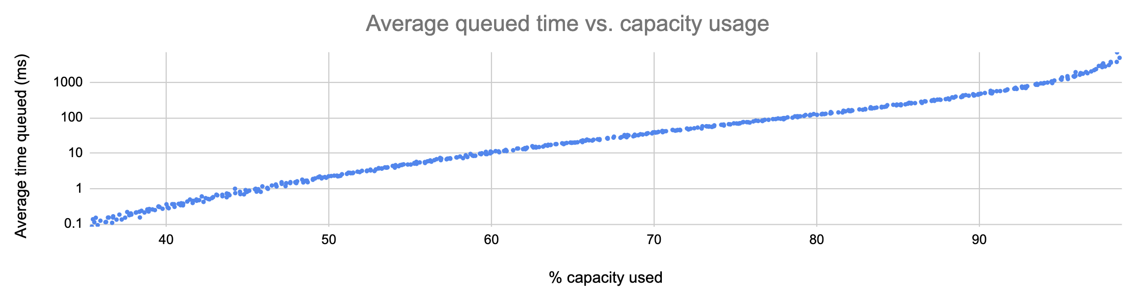
I spent a day or two building a computational model of the behavior of an upstream under load. The model is on my GitHub. I won’t bore you with the details, but essentially, requests arrive at the upstream at a set interval, and each request takes a random amount of time to execute. If there are more than 12 requests in flight, further requests are queued until slots free up. We add up the number of microseconds spent queued versus in flight, and voilà: a working model that largely agrees with our real-world observations.
Here’s what the model told me:
In the graph above, each point represents a run of the simulation with a different average request rate. As you can see, the average number of milliseconds spent by requests in the upstream-local queue is tightly correlated to utilization, and it grows more or less exponentially.
This is a huge problem! As more capacity is used, requests experience, on average, exponentially more latency:
% capacity used
Average latency due to ULQ
40%
0.29ms
50%
2.22ms
60%
11.4ms
70%
38.4ms
80%
127ms
90%
461ms
95%
1372ms
And remember: this is just on average. 90th- and 99th-percentile latencies can climb to unacceptable levels far sooner.
What’s worse, ULQ affects all requests equally. If the average added latency is, say, 10ms, then a request that would normally take 1000ms will instead take 1010ms, for a slowdown of 1%. But a request that would normally take 5ms will take on average 15ms: a 300% performance hit. This means more requests sitting around in your stack eating up resources for no good reason. It also means, if clients of your service tend to do many individual requests in sequence (like a web browser, for example), that overall user experience can suffer drastically before this problem even appears that bad.
What to do about it
As I said before, this is a quite general problem. Switching web servers won’t fix it, nor will scaling up. Switching from random-number to round-robin load balancing, or vice versa, will not fix it. There are 3 classes of solution.
The first class of solution is the dumbest. But hey, maybe you need your upstream-local queueing problem fixed now and you don’t have time to be smart. In this case, here’s what you do: set a threshold, and meet it by keeping enough of your capacity idle. Referring to the table above, if we decided on a threshold of 11ms average ULQ latency, then we’d need to keep at least 40% of our capacity idle at all times.
I told you it was dumb. But it is easy. The other two solutions are less easy.
The second solution is to reduce your application’s latency variance. If some requests take 10 milliseconds and others take 30000, then upstream-local queueing rears its ugly head. If, instead, all your requests take between 30 and 35 milliseconds (or between 3 and 3.5 seconds, for that matter), its effect is much less pronounced. By hacking away at the long tail of your latency distribution, you may be able to push the worst effects of ULQ further to the right-hand-side of the graph. But, at the end of the day, exponential growth is exponential growth. It’s not really a fix.
The best thing you can do, of course, is use a more sophisticated load balancing algorithm. This necessitates that your load balancing software supports one. If, for example, you use a least outstanding requests algorithm, then upstream-local queueing simply won’t occur until you’ve exhausted all of your upstream capacity. It ceases to be a scaling problem.
How to tell how bad ULQ is in your stack
For a quick and dirty answer to the question “How much latency is ULQ contributing in my system?” you can make a simple graph dashboard. Take the 90th percentile latency as measured by the load balancer, and subtract the 90th percentile latency as measured by the upstream.
If these curves grow and shrink along with your throughput, you probably have an upstream-local queueing problem. And if the peaks are getting higher, that problem is getting worse.
The numbers resulting from this calculation are not a rigorous measurement of anything in particular. You can’t really add or subtract percentiles. But it’s often a very easy calculation to do, and as long as you don’t make inferences based on the values of the numbers – just the shapes of the curves – you can get some quick confidence this way before you proceed with a deeper investigation. And then you can fix it.
You only need to learn a little bit of queueing theory before you start getting that ecstatic “everything is connected!” high that good math always evokes. So many damn things follow the same set of abstract rules. Queueing theory lets you reason effectively about an enormous class of diverse systems, all with a tiny number of theorems.
I want to share with you the most important fundamental fact I have learned about queues. It’s counterintuitive, but once you understand it, you’ll have deeper insight into the behavior not just of CPUs and database thread pools, but also grocery store checkout lines, ticket queues, highways – really just a mind-blowing collection of systems.
Okay. Here’s the Important Thing:
As you approach maximum throughput, average queue size – and therefore average wait time – approaches infinity.
“Wat,” you say? Let’s break it down.
Queues
A queueing system is exactly what you think it is: a processor that processes tasks whenever they’re available, and a queue that holds tasks until the processor is ready to process them. When a task is processed, it leaves the system.
A queueing system with a single queue and a single processor. Tasks (yellow circles) arrive at random intervals and take different amounts of time to process.
The Important Thing I stated above applies to a specific type of queue called an M/M/1/∞ queue. That blob of letters and numbers and symbols is a description in Kendall’s notation. I won’t go into the M/M/1 part, as it doesn’t really end up affecting the Important Thing I’m telling you about. What does matter, however, is that ‘∞’.
The ‘∞’ in “M/M/1/∞” means that the queue is unbounded. There’s no limit to the number of tasks that can be waiting in the queue at any given time.
Like most infinities, this doesn’t reflect any real-world situation. It would be like a grocery store with infinite waiting space, or an I/O scheduler that can queue infinitely many operations. But really, all we’re saying with this ‘∞’ is that the system under study never hits its maximum occupancy.
Capacity
The processor (or processors) of a queueing system have a given total capacity. Capacity is the number of tasks per unit time that can be processed. For an I/O scheduler, the capacity might be measured in IOPS (I/O operations per second). For a ticket queue, it might be measured in tickets per sprint.
Consider a simple queueing system with a single processor, like the one depicted in the GIF above. If, on average, 50% of the system’s capacity is in use, that means that the processor is working on a task 50% of the time. At 0% utilization, no tasks are ever processed. At 100% utilization, the processor is always busy.
Let’s think about 100% utilization a bit more. Imagine a server with all 4 of its CPUs constantly crunching numbers, or a dev team that’s working on high-priority tickets every hour of the day. Or a devOp who’s so busy putting out fires that he never has time to blog.
When a system has steady-state 100% utilization, its queue will grow to infinity. It might shrink over short time scales, but over a sufficiently long time it will grow without bound.
Why is that?
If the processor is always busy, that means there’s never even an instant when a newly arriving task can be assigned immediately to the processor. That means that, whenever a task finishes processing, there must always be a task waiting in the queue; otherwise the processor would have an idle moment. And by induction, we can show that a system that’s forever at 100% utilization will exceed any finite queue size you care to pick:
No good. Processor idle, so utilization can’t be 100%.
No good. As soon as the task finishes, we’re back to the above picture.
No good. As soon as the current task finishes, we’re back to the above picture, which we’ve already decided is no good.
You get the idea.
So basically, the statements “average capacity utilization is 100%” and “the queue size is growing without bound” are equivalent. And remember: by Little’s Law, we know that average service time is directly proportional to queue size. That means that a queueing system with 100% average capacity utilization will have wait times that grow without bound.
If all the developers on a team are constantly working on critical tickets, then the time it takes to complete tickets in the queue will approach infinity. If all the CPUs on a server are constantly grinding, load average will climb and climb. And so on.
Now you may be saying to yourself, “100% capacity utilization is a purely theoretical construct. There’s always some amount of idle capacity, so queues will never grow toward infinity forever.” And you’re right. But you might be surprised at how quickly things start to look ugly as you get closer to maximum throughput.
What about 90%?
The problems start well before you get to 100% utilization. Why?
Sometimes a bunch of tasks will just happen to show up at the same time. These tasks will get queued up. If there’s not much capacity available to crunch through that backlog, then it’ll probably still be around when the next random bunch of tasks show up. The queue will just keep getting longer until there happens to be a long enough period of low activity to clear it out.
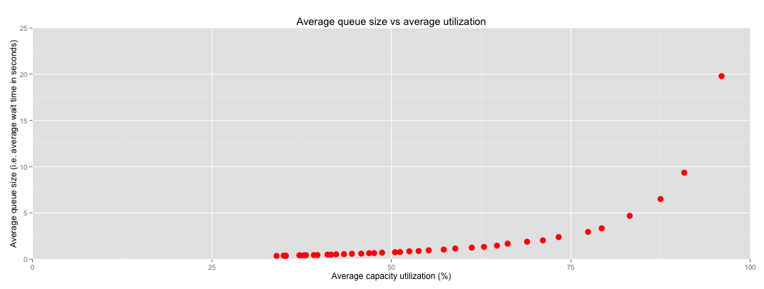
I ran a qsim simulation to illustrate this point. It simulates a single queue that can process, on average, one task per second. I ran the simulation for a range of arrival rates to get different average capacity usages. (For the wonks: I used a Poisson arrival process and exponentially distributed processing times). Here’s the plot:
Notice how things start to get a little crazy around 80% utilization. By the time you reach 96% utilization (the rightmost point on the plot), average wait times are already 20 seconds. And what if you go further and run at 99.8% utilization?
Check out that Y axis. Crazy. You don’t want any part of that.
This is why overworked engineering teams get into death spirals. It’s also why, when you finally log in to that server that’s been slow as a dog, you’ll sometimes find that it has a load average of like 500. Queues are everywhere.
What can be done about it
To reiterate:
As you approach maximum throughput, average queue size – and therefore average wait time – approaches infinity.
What’s the solution, then? We only have so many variables to work with in a queueing system. Any solution for the exploding-queue-size problem is going to involve some combination of these three approaches:
Increase capacity
Decrease demand
Set an upper bound for the queue size
I like number 3. It forces you to acknowledge the fact that queue size is always finite, and to think through the failure modes that a full queue will engender.
Stay tuned for a forthcoming blog post in which I’ll examine some of the common methods for dealing with this property of queueing systems. Until then, I hope I’ve helped you understand a very important truth about many of the systems you encounter on a daily basis.
EDIT 2023-01-16: Since I wrote this, I’ve gotten really into what I call descriptive engineering and the Maxwell’s Demon approach. I still don’t think it’s worthwhile to try to predict novel failures automatically based on telemetry, but predicting novel failures manually based on intuition and elbow grease is super useful.
I often meet with skepticism when I say that server monitoring systems should only page when a service stops doing its work. It’s one of the suggestions I made in my Smoke Alarms & Car Alarms talk at Monitorama this year. I don’t page on high CPU usage, or rapidly-growing RAM usage, or anything like that. Skeptics usually ask some variation on:
If you only alert on things that are already broken, won’t you miss opportunities to fix things before they break?
The answer is a clear and unapologetic yes! Sometimes that will happen.
It’s easy to be certain that a service is down: just check whether its work is still getting done. It’s even pretty easy to detect a performance degradation, as long as you have clearly defined what constitutes acceptable performance. But it’s orders of magnitude more difficult to reliably predict that a service will go down soon without human intervention.
We like to operate our systems at the very edge of their capacity. This is true not only in tech, but in all sectors: from medicine to energy to transportation. And it makes sense: we bought a certain amount of capacity: why would we waste any? But a side effect of this insatiable lust for capacity is that it makes the line between working and not working extremely subtle. As Mark Burgess points out in his thought-provoking In Search of Certainty, this is a consequence of nonlinear dynamics (or “chaos theory“), and our systems are vulnerable to it as long as we operate them so close to an unstable region.
But we really really want to predict failures! It’s tempting to try and develop increasingly complex models of our nonlinear systems, aiming for perfect failure prediction. Unfortunately, since these systems are almost always operating under an unpredictable workload, we end up having to couple these models tightly to our implementation: number of threads, number of servers, network link speed, JVM heap size, and so on.
This is just like overfitting a regression in statistics: it may work incredibly well for the conditions that you sampled to build your model, but it will fail as soon as new conditions are introduced. In short, predictive models for nonlinear systems are fragile. So fragile that they’re not worth the effort to build.
Instead of trying to buck the unbuckable (which is a bucking waste of time), we should seek to capture every failure and let our system learn from it. We should make systems that are aware of their own performance and the status of their own monitors. That way we can build feedback loops and self-healing into them: a strategy that won’t crumble when the implementation or the workload takes a sharp left.
We’ve come a long way in recognizing that humans are integral to our systems, and that human error is an unavoidable reality in these systems. There’s a lot of talk these days about the necessity of blameless postmortems (for example, this talk from Devops Days Brisbane and this blog post by Etsy’s Daniel Schauenberg), and I think that’s great.
The discussion around blamelessness usually focuses on the need to recognize human interaction as apart of a complex system, rather than external force. Like any system component, an operator is constrained to manipulate and examine the system in certain predefined ways. The gaps between the system’s access points inevitably leave blind spots. When you think about failures this way, it’s easier to move past human errors to a more productive analysis of those blind spots.
That’s all well and good, but I want to give a mathematical justification for blamelessness in postmortems. It follows directly from one of the fundamental theorems of probability.
Bayes’ Theorem
Some time in the mid 1700s, the British statistician and minister Thomas Bayes came up with a very useful tool. So useful, in fact, that Sir Harold Jeffreys said Bayes Theorem “is to the theory of probability what Pythagoras’s theorem is to geometry.”
Bayes’ Theorem lets us perform calculations on what are called conditional probabilities. A conditional probability is the probability of some event (we’ll call it E) given that another event (which we’ll call D) has occurred. Such a conditional probability would be written
The “pipe” character between ‘E’ and ‘D’ is pronounced “given that.”
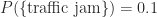
For example, let’s suppose that there’s a 10% probability of a traffic jam on your drive to work. We would write that as
That’s just a regular old probability. But suppose we also know that, when there’s an accident on the highway, the probability of a traffic jam quadruples up to 40%. We would write that number, the probability of a traffic jam given that there’s been an accident, using the conditional probability notation:
Bayes’ Theorem lets us use conditional probabilities like these to calculate other conditional probabilities. It goes like this:
In our traffic example, we can use Bayes’ Theorem to calculate the probability that there’s been an accident given that there’s a traffic jam. Informally, you could call this the percentage of traffic jams for which car accidents are responsible. Assuming we know that the probability of a car accident on any given morning is 1 in 5, or 0.2, we can just plug the events in which we’re interested into Bayes’ Theorem:
Mistakes
Bayes’ Theorem can give us insight into the usefulness of assigning blame for engineering decisions that go awry. If you take away all the empathy- and complexity-based arguments for blameless postmortems, you still have a pretty solid reason to look past human error to find the root cause of a problem.
Engineers spend their days making a series of decisions, most of which are right but some of which are wrong. We can gauge the effectiveness of an engineer by the number N of decisions she makes in a given day and the probability P(M) that any given one of those decisions is a mistake.
Suppose we have a two-person engineering team — Eleanor and Liz — who work according to these parameters:
Eleanor: Makes 120 decisions per day. Each decision has a 1-in-20 chance of being a mistake.
Liz: Makes 30 decisions per day. Each decision has a 1-in-6 chance of being a mistake.
Eleanor is a better engineer both in terms of the quality and the quantity of her work. If one of these engineers needs to shape up, it’s clearly Liz. Without Eleanor, 4/5 of the product wouldn’t exist.
But if the manager of this team is in the habit of punishing engineers when their mistakes cause a visible problem (for example, by doing blameful postmortems), we’ll get a very different idea of the team’s distribution of skill. We can use Bayes’ Theorem to see this.
The system that Eleanor and Liz have built is running constantly, and let’s assume that it’s exercising all pieces of its functionality equally. That is, at any time, the system is equally likely to be executing any given behavior that’s been designed into it. (Sure, most systems strongly favor certain execution paths over others, but bear with me.)
Well, 120 out of 150 of the system’s design decisions were made by Eleanor, so there’s an 80% chance that the system is exercising Eleanor’s functionality. The other 20% of the time, it’s exercising Liz’s. So if a bug crops up, what’s the probability that Eleanor designed the buggy component? Let’s define event A as “Eleanor made the decision” and event B as “The decision is wrong”. Bayes’ theorem tells us that
which, in the context of our example, lets us calculate the probability P(A|B) that Eleanor made a particular decision given that the decision was wrong (i.e. contains a bug). We already know two of the quantities in this formula:
P(B|A) reads as “the probability that a particular decision is wrong given that Eleanor made that decision.” Referring to Eleanor’s engineering skills above, we know that this probability is 1 in 20.
P(A) is the probability that Eleanor made a particular decision in the system design. Since Eleanor makes 120 decisions a day and Liz only makes 30, P(A) is 120/150, or 4 in 5.
The last unknown variable in the formula is P(B): the probability that a given design decision is wrong. But we can calculate this too; I’ll let you figure out how. The answer is 11 in 150.
Now that we have all the numbers, let’s plug them in to our formula:
In other words, Eleanor’s decisions are responsible for 54.5% of the mistakes in the system design. Remember, this is despite the fact that Eleanor is clearly the better engineer! She’s both faster and more thorough than Liz.
So think about how backwards it would be to go chastising Eleanor for every bug of hers that got found. Blameful postmortems don’t even make sense from a purely probabilistic angle.
But but but…
Could Eleanor be a better engineer by making fewer mistakes? Of course. The point here is that she’s already objectively better at engineering than Liz, yet she ends up being responsible for more bugs than Liz.
Isn’t this a grotesquely oversimplified model of how engineering works? Of course. But there’s nothing to stop us from generalizing it to account for things like the interactions between design decisions, variations in the severity of mistakes, and so on. The basic idea would hold up.
Couldn’t Eleanor make even fewer mistakes if she slowed down? Probably. That’s a tradeoff that Eleanor and her manager could discuss. But the potential benefit isn’t so cut-and-dry. If Eleanor slowed down to 60 decisions per day with a mistake rate of 1:40, then
fewer features (40% fewer!) would be making it out the door, and
a higher proportion of the design decisions would now be made by bug-prone Liz, such that the proportion of decisions that are bad would only be reduced very slightly — from 7.33% to 7.22%
So if, for some crazy reason, you’re still stopping your postmortems at “Eleanor made a mistake,” stop it. You could be punishing engineers for being more effective.
I just spent 2 days at Devops Days Minneapolis, the first Devops Days in the Midwest. My brain is still whirling. I was brainstorming while I wrote this; forgive me if it goes astray.
The organizers of the conference (too many to name here) did a super admirable job of building a diverse, empathy-oriented conference while keeping the spotlight on tech. It was really a wonderful conference.
What really strikes me about the fascinating people I’ve met over the last two days is the diversity of their backgrounds and passions. The tech industry attracts all sorts of fascinating people, from philosophy PhDs to roadies who used to tour with Pantera. Our field has become a real melting pot of viewpoints, and that’s a beautiful thing.
However, we’re all doing engineering now. Most of us are doing engineering without any formal engineering training. And I firmly believe that any engineer will be much more effective with a few basic statistical tools in their back pocket.
I proposed an Open Space on this topic, asking the question “Why are so many engineers in tech reluctant to learn any math, despite knowing how useful math can be?” The session attracted a bunch of very smart people, and I came away with many new insights.
We teach how to math, but not why to math
When I give talks to software and ops engineers about math, they eat it right up. They have a strong intuitive sense that math is good and useful and powerful.
On the other hand, when I talk to individuals in tech about math, I’m often shocked at how quickly they shut down. They say things like “Oh, I’m no good at math,” or “I don’t have time to do math,” or “There’s no use for math in what I do.” It smacks of C.P. Snow’s observations on the Two Cultures, but these are people in a career that most humans would place solidly on the analytical side of that intellectual chasm. But chatting at Devops Days reminded me of a really important fact that can help explain this phenomenon.
Math is a part of everyone’s education, but statistics is not.
That’s absurd! Statistics in the single most widely applicable branch of mathematics. You can apply it directly to your life with practical, observable benefits no matter who you are or what you do. Instead, we learn algebra, geometry, trigonometry, and calculus — wonderful, rich disciplines to be sure — but without statistics, you can’t blame students for thinking that math is too abstract and academic to be useful in their lives.
So now, when people inexperienced in math hear “You should learn some math,” they think of impenetrable equations winding across boards, or they draw on “Good Will Hunting” and “A Beautiful Mind” and imagine that they’re being asked to do novel number theory research.
This is one of the biggest misconceptions we need to break. We need to spread the message that statistics is universally applicable, practical, and not very hard to learn with modern tools.
Staring at a blank wall
Local mathematician and Rubyist Kaisa Taipale makes a good point: when you’re new to computers, you worry a lot about making mistakes. The pictures on the screen doesn’t map onto a logical framework, you don’t know the right questions to ask, and as Pagerduty’s David Shackelford puts it, you can’t push past the blankness. Being new to stats is very similar.
In our session, we discussed two ways to remove the hurdles in front of stats-curious engineers. First of all, it’s critical that we make data gathering as trivial as possible. It’s easy to tell someone to look at the data, but when the data’s in the form of million-line Apache logfiles that need to be massaged and crunched and filtered with a custom script, that person will be frustrated and angry before they even start their analysis! At my company, I’ve written scripts to pull data out of Graphite and Logstash into R, but I haven’t been very forthcoming or solicitous about those scripts. I’ll change that.
The other major hurdle to understanding data is the academic undertone of the existing tools. I love me some R, but I’ll be the first to admit that it’s not the friendliest piece of software for someone who’s newly curious about data analysis. We need to spread knowledge of some easier and more accessible stats tools, like Tableau and Statwing, and maybe come up with some open source alternatives.
Once you push past the feeling that you need a PhD to even ask the right questions about data, stats learning becomes a positive feedback loop that benefits everybody in the organization. Let’s keep the discussion going and make sure that the potential data addicts in our midst don’t get discouraged.
You can teach the thought process
Statistical inference, and math in general, can seem like a gift. People think “I just don’t get it. I don’t have the spark for math.”
On the contrary, math is a set of skills that you can learn. They can be taught. In fact, Ian Malpass teaches a course at Etsy called “Graphite Bootcamp,” where interested engineers can learn what an integral means (“it just means adding stuff up,” he says) or how to use time series smoothing techniques.
Math is a tool that can take you from a bunch of opaque, independently useless metrics to a meaningful number that gives you real insight into the system. That’s exactly the mindset that Ian teaches in his class. This is a fantastic idea, and I would love to see other companies copy Ian’s idea and build upon it.
My point
My point here is: a bit of statistics is easy to learn, useful in almost any situation, and beneficial to the level of discourse and decision-making in any organization. If there are barriers stopping engineers from learning it, then those barriers should be attacked furiously until they’re gone. Math still leaves room for arguments over interpretation, but when we’re arguing about data we’re much much more likely to make the right decision.
If you believe — as I do — that everything worth talking about is measurable, then it probably irritates you sometimes when you hear everybody talk about scalability. We all recognize that we want to build systems that can adapt to changing capacity requirements, sure, but how do you measure how scalable your system is? How do you know when you’ve improved its scalability? How do you know how much you’ve improved it?
I propose that we pick a definition of scalability that lets us attach a number to it. When you say a system is highly scalable what you probably mean is that when you need to add capacity, you can do so without spending too much time or money. So here’s how we should define scalability:
Scalability = d(capacity)/d(money spent)
In case you’re rusty on calculus, this means scalability is the derivative of capacity with respect to money spent. And even if you’re even rustier, think about it as “how much capacity you get for a dollar.”
I’ve got an example that should make it more intuitive.
Calculating the scalability of a web cluster
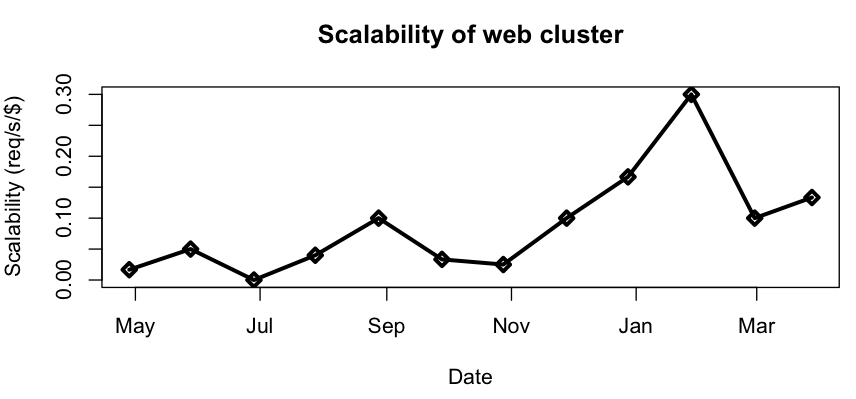
Suppose you have a cluster of web servers whose capacity you measure in requests per second. A plot of that value over the course of a year might look like this:
Similarly, you could plot the total amount of money (including time spent on labor, if you have to do anything manually), cumulatively spent on web cluster capacity. You probably don’t have this metric, and neither do I (yet), but bear with me.
If you have both of these quantities available, then you can take your capacity datapoints and plot them against money datapoints from the same time. In math, we call this parameterizing by time.
And finally we can get at d(Capacity)/d(Money). For discrete quantities like these, it suffices to plot the ratios between the increments by which capacity and money change. You can easily get at those values with R’s diff() function. Here’s what ours look like:
So our scalability has increased since last May. In fact, we can say that it has increased by at least 0.1 req/s/$.
Think about it
I’m sure this is not a super practical calculation for most ops teams. But I do think it’s a useful way to think about scalability. Since I started thinking about scalability in this way, it’s felt more like a real thing. And honestly there’s not that much standing in the way of calculating this number for real, so maybe I’ll start doing it.
What do you think? Do you have a better definition for scalability that yields a quantity?
Wouldn’t you like to live in a world where your monitoring systems only alerted when things were actually broken? And wouldn’t it be great if, in that world, your alerts would always fire if things were broken?
Well so would everybody else. But we don’t live in that world. When we choose a threshold for alerting, we usually have to make a tradeoff between the chance of getting a false positive (an alert that fires when nothing is wrong) and the chance of getting a false negative (an alert that doesn’t fire when something is wrong).
Take the load average on an app server for example: if it’s above 100, then your service is probably broken. But there’s still a chance that the waiting processes aren’t blocking your mission-critical code paths. If you page somebody on this threshold, there’s always a chance that you’ll be waking that person up in the middle of the night for no good reason. However, if you raise the threshold to 200 to get rid of such spurious alerts, you’re making it more likely that a pathologically high load average will go unnoticed.
When presented with this tradeoff, the path of least resistance is to say “Let’s just keep the threshold lower. We’d rather get woken up when there’s nothing broken than sleep through a real problem.” And I can sympathize with that attitude. Undetected outages are embarrassing and harmful to your reputation. Surely it’s preferable to deal with a few late-night fire drills.
It’s a trap.
In the long run, false positives can — and will often — hurt you more than false negatives. Let’s learn about the base rate fallacy.
The base rate fallacy
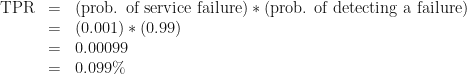
Suppose you have a service that works fine most of the time, but breaks occasionally. It’s not trivial to determine whether the service is working, but you can write a probe that’ll detect its state correctly 99% of the time:
If the service is working, there’s a 1% chance that your probe will say it’s broken
If the service is broken, there’s a 1% chance that your probe will say it’s working
Naïvely, you might expect this probe to be a decent check of the service’s health. If it goes off, you’ve got a pretty good chance that the service is broken, right?
No. Bad. Wrong. This is what logicians and statisticians call the “base rate fallacy.” Your expectation hinges on the assumption that the service is only working half the time. In reality, if the service is any good, it works almost all the time. Let’s say the service is functional 99.9% of the time. If we assume the service just fails randomly the other 0.1% of the time, we can calculate the true-positive rate:
That is to say, about 1 in 1000 of all tests will run during a failure and detect that failure correctly. We can also calculate the false-positive rate:
So almost 1 test in 100 will run when the service is not broken, but will report that it’s broken anyway.
You should already be feeling anxious.
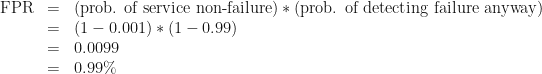
With these numbers, we can calculate what the medical field calls the probe’s positive predictive value: the probability that, if a given test produces a positive result, it’s a true positive. For our purposes this is the probability that, if we just got paged, something’s actually broken.
Bad news. There’s no hand-waving here. If you get alerted by this probe, there’s only a 9.1% chance that something’s actually wrong.
Car alarms and smoke alarms
When you hear a car alarm going off, do you run to the window and start looking for car thieves? Do you call 9-1-1? Do you even notice car alarms anymore?
Car alarms have a very low positive predictive value. They go off for so many spurious reasons: glitchy electronics, drunk people leaning on the hood, accidental pressing of the panic button. And as a result of this low PPV, car alarms are much less useful as theft deterrents than they could be.
Now think about smoke alarms. People trust smoke alarms. When a smoke alarm goes off in a school or an office building, everybody stops what they’re doing and walks outside in an orderly fashion. Why? Because when smoke alarms go off (and there’s no drill scheduled), it frequently means there’s actual smoke somewhere.
This is not to say that smoke alarms have a perfect PPV, of course, as anybody who’s lost half an hour of their time to a false positive will tell you. But their PPV is high enough that people still pay attention to them.
We should strive to make our alerts more like smoke alarms than car alarms.
Sensitivity and specificity
Let’s go back to our example: probing a service that works 99.9% of the time. There’s some jargon for the tradeoff we’re looking at. It’s the tradeoff between the sensitivity of our test (the probability of detecting a real problem if there is one) and its specificity (the probability that we won’t detect a problem if there isn’t one).
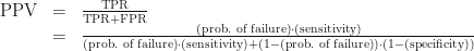
Every time we set a monitoring threshold, we have to balance sensitivity and specificity. And one of the first questions we should ask ourselves is: “How high does our specificity have to be in order to get a decent positive predictive value?” It just takes some simple algebra to figure this out. We start with the PPV formula we used before, enjargoned below:
To make this math a little more readable, let’s let p = PPV, f = the probability of service failure, a = sensitivity, and b = specificity. And let’s solve for b.
So, sticking with the parameters of our initial example (0.1% probability of service failure, 99% sensitivity) and deciding that we want a positive predictive value of at least 90% (so that 9 out of 10 alerts will mean something’s actually broken), we end up with
The necessary specificity is about 99.99% — that’s way higher than the sensitivity of 99%! In order to get a probe that detects failures in this service with sufficient reliability, you need to be 100 times less likely to falsely detect a failure than you are to miss a positive!
So listen.
You’ll often be tempted to favor high sensitivity at the cost of specificity, and sometimes that’s the right choice. Just be careful: avoid the base rate fallacy by remembering that your false-positive rate needs to be much smaller than your failure rate if you want your test to have a decent positive predictive value.


![P(A|B) = \frac{[1/20] \cdot [4/5]}{[11/150]}](https://s0.wp.com/latex.php?latex=P%28A%7CB%29+%3D+%5Cfrac%7B%5B1%2F20%5D+%5Ccdot+%5B4%2F5%5D%7D%7B%5B11%2F150%5D%7D+&bg=ffffff&fg=202020&s=0&c=20201002)


