Squeeze the hell out of the system you have

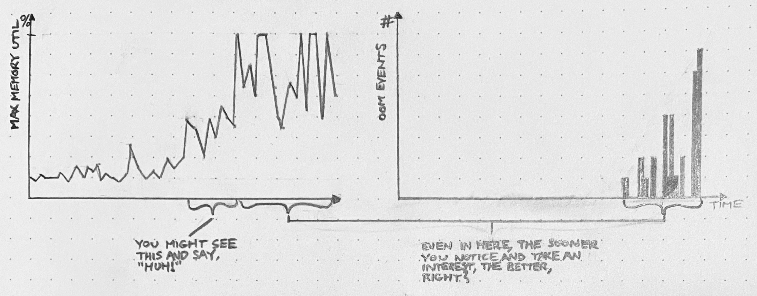
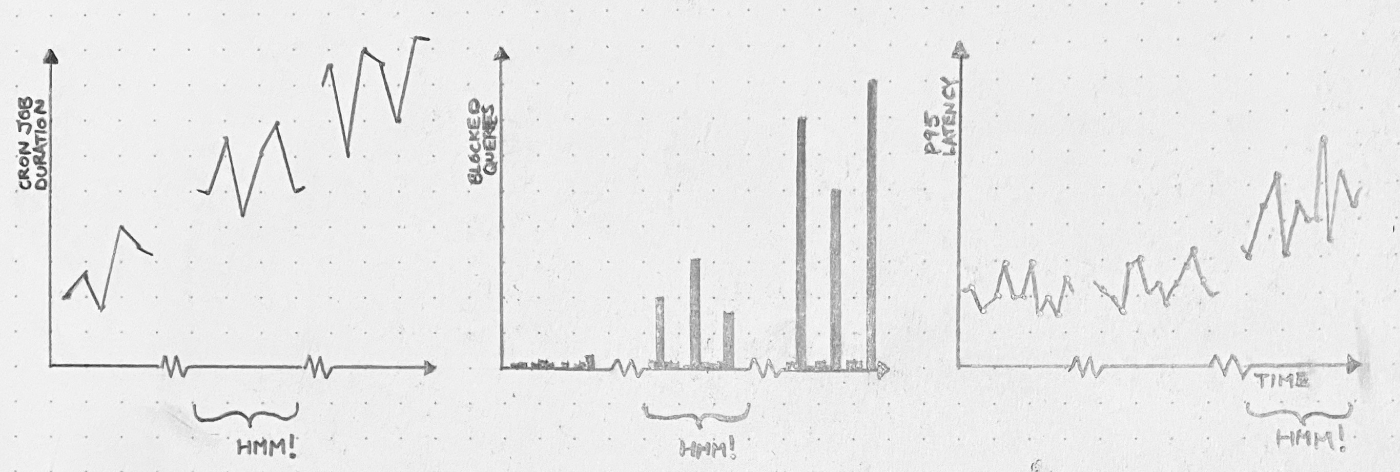
About a year ago, I raised a red flag with colleagues and managers about Postgres performance. Our database was struggling to keep up with the load generated by our monolithic SaaS application. CPU utilization was riding between 60 and 80%, and at least once it spiked to 100%, causing a brief outage.

Now, we had been kicking the can down the road with respect to Postgres capacity for a long time. When the database looked too busy, we’d replace it with a bigger instance and move on. This saved us a lot of time and allowed us to focus on other things, like building features, which was great.

But this time, it wasn’t possible to scale the DB server vertically: we were already on the biggest instance. And we were about to overload that instance.

Lots of schemes were floated. Foremost among them:

  • Shard writes. Spin up a cluster of independent databases, and write data to one or the other according to some partitioning strategy.
  • Do micro-services. Split up the monolith into multiple interconnected services, each with its own data store that could be scaled on its own terms.

Both of these options are cool! A strong case can be made for either one on its merits. With write sharding, we could potentially increase our capacity by 2 or even 3 orders of magnitude. With micro-services, we’d be free to use “the right tool for the job,” picking data stores optimized to the requirements of each service workload. Either branch of the skill tree would offer exciting options for fault tolerance and operational resilience.

Either way, everyone had to agree: we’d outgrown our old, naïve implementation. Onward and upward! We can do hard things!

In situations like this, presented with a dazzling array of next-generation architecture options that can be built to last us through the decade, it’s easy to forget what our goal was: to get database performance under control.

Complexity costs attention.

Sometimes, leaps in complexity must be made. It’s generally a good problem to have. If enough demand is being placed on your system to render obsolete your existing technology, then even more growth is probably on the horizon! If you can just put in the investment and build the more advanced architecture now, then you’ll be looking at a bright future of unconstrained year-over-year success.

But don’t just consider the implementation cost. The real cost of increased complexity – often the much larger cost – is attention.

If you decide to shard across databases, then not only must you pay the money-, time-, and opportunity cost of building out the new architecture: you must also take the new complexity into account in every subsequent technical decision. Want to shard writes? Fine, but this complicates every future decision about backups, monitoring, migrations, the ORM, and network topology (just to name a few). And don’t get me started on micro-services.

Just think about how massive these costs are. How much feature delivery will have to be delayed or foregone to support the additional architectural complexity?

Always squeeze first

We should always put off significant complexity increases as long as possible.

When complexity leaps are on the table, there’s usually also an opportunity to squeeze some extra juice out of the system you have. By tweaking the workload, tuning performance, or supplementing the system in some way, you may be able to add months or even years of runway. When viable, these options are always preferable to building out a next-gen system.

Let’s return to the example of the overloaded Postgres instance. In that case, what we ended up doing was twofold:

  1. Two engineers (me and my colleague Ted – but mostly Ted) spent about 3 months working primarily on database performance issues. There was no silver bullet. We used our telemetry to identify heavy queries, dug into the (Rails) codebase to understand where they were coming from, and optimized or eliminated them. We also tuned a lot of Postgres settings.
  2. Two more engineers cut a path through the codebase to run certain expensive read-only queries on a replica DB. This effort bore fruit around the same time as (1), when we offloaded our single most frequent query (a SELECT triggered by polling web clients).

These two efforts together reduced the maximum weekly CPU usage on the database from 90% to 30%.

Now we can sleep at night. We have a huge amount of room to grow, both in terms of CPU headroom and our ability to shed load from the primary. And furthermore, since our work touched many parts of the codebase and demanded collaboration with lots of different devs, we now have a strong distributed knowledge base about the existing system. We’re well positioned to squeeze it even more if need be.

This doesn’t mean complexity is bad

Of course, I’m not saying complexity is bad. It’s necessary. Some day we’ll reach a fundamental limit of our database architecture, and before that day arrives, we’ll need to make a jump in complexity.

But until then, because we squeezed first, we get to keep working with the most boring system possible. This is by far the cheaper and more practical option.

It’s fine to use names in post-mortems

Sometimes, during an incident post-mortem, we need to talk about the actions of a specific person. It’s awkward. We want to be blameless, right? If we say, “Steve rebooted the wrong server,” aren’t we undermining the principle of blamelessness? Shouldn’t we say, “An engineer rebooted the wrong server” instead?

This tension is rooted in a misunderstanding of blamelessness. The purpose of the blameless post-mortem is not to make everyone feel comfortable. Discomfort can be healthy and useful. The purpose of the blameless post-mortem is to let us find explanations deeper than human error.

If we say, “This outage happened because Steve rebooted the wrong server,” then we make Steve the sole agent in the narrative. By this logic, the only way to avoid more future outages is for Steve to do better (or get fired). This is the kind of shallow analysis that blameless post-mortems help us avoid.

But it’s okay to say, “Steve rebooted the wrong server,” as long as you don’t blame Steve for the failure. You’re just stating a fact. Everybody knows it was Steve who rebooted the server. Steve sure knows it: he’s been beating himself up about it all weekend.

But why did Steve reboot the wrong server? Could it have had something to do with the fact that the server’s command prompt contains the opaque EC2 instance ID instead of a meaningful hostname? Was Steve coming off a 70-hour week? Come to think of it, why is it that rebooting that particular server can cause a total failure? If you’re asking questions like these instead of stopping at “Steve fucked up,” then you’re doing blamelessness.

So just say the name. It’s fine.

P.S. – obviously this doesn’t apply if you’re in the kind of organization that will retaliate against Steve for making an honest mistake. Don’t sell out your coworkers to bloodthirsty management.

Incident metrics tell you nothing about reliability

When an incident response process is created, there arise many voices calling for measurement. “As long as we’re creating standards for incidents, let’s track Mean-Time-To-Recovery (MTTR) and Mean-Time-To-Detection (MTTD) and Mean-time-Between-Failures (MTBF)!” they say things like.

Usually there’s no further discussion on this point. Everyone agrees that more data is better (“but let’s make sure we interpret the data correctly, of course!”). As practitioners, it’s exciting to think that these metrics will finally let us demonstrate concrete results for all the effort we put into reliability. Middle management, for its part, looks forward to having a “north star” for reliability work. No more wishy-washy “we believe this project improved system reliability substantially” hand-waving: the initiative either moved the needle on MTBF or it didn’t.

The assumption underlying all this is that incident data can shed light on a system’s reliability. But this assumption is never warranted. Analysis of your incident data may shed light on your incidents. But incident data really can’t tell you anything about your reliability.

Picture this. Your team owns a web service. You’ve set up an alert on latency. If the 90th percentile latency exceeds 100 milliseconds, your team gets paged and you start an incident.

One day, you find out that, really, if that 90th percentile latency even gets above 50 milliseconds, it’s already a problem. Downstream services start getting sluggish, and user experience suffers. “No problem,” you say, lowering the alert threshold to 50 milliseconds.

Now you’re able to observe more failures. Or, if you prefer: you’ve widened the definition of “failure” to include more events. But the system’s reliability has in no way been altered. And yet, you will have more incidents. Possibly quite a few more! Mean-time-between-failures will drop.

Picture this. Every once in a while, the database gets into a “wedged” state, where a bunch of queries are piled up and work grinds to a halt. It’s simple to un-wedge it: just manually kill the query that caused the pileup, and everything else gets flushed through the system. Each time the database gets wedged, the database team gets paged, they start an incident, they find and kill the query, and the incident is over. These incidents happen semi-regularly, but at least they’re over quickly.

After a while, someone finally implements a fix. Those problematic queries? Gone! No more pointless incidents spun up just to manually clear out a pileup. And, more importantly: no more service degradations resulting from this problem. The reliability of the system has improved!

So what happens to the incident metrics? MTBF goes up, of course. That checks out: there are fewer incidents now. But what about MTTR? Before the fix, MTTR was low. These query-pileup incidents were frequent and short, so they kept mean-time-to-recovery anchored down. After the fix – which, remember, corresponded to a direct and pure improvement in reliability – mean-time-to-recovery is higher. Whoopsy daisy!

Picture this. You have a particular customer whose use-case tests the limits of your product’s capabilities. And furthermore, this customer is, let’s say, somewhat of a squeaky wheel. Every 2 or 3 weeks, they file a support ticket about something-or-other, and the problem is usually tricky enough that an incident gets spun up.

Eventually this customer has had enough. They leave. This represents both a sizable blow to revenue and a scathing indictment of your product’s reliability at scale. But, on the bright side, both MTTR and MTBF benefit enormously! That’ll look great on the quarterly slide deck.

When someone says they want to measure incident metrics (MTTR or MTBF or any other one in the family), I always want to ask them, “What’s your model?”

Many people rush to collect data without first considering whether they can come up with a model powerful enough to interpret the data. If our model is bad, then we’ll make bad decisions even with good data. And if, as is often the case, we have no explicit model at all, then our implicit model is just, “Reliability up, MTBF up, MTTR down.” Which, as we’ve seen, doesn’t match our observations even in straightforward, common scenarios.

Don’t waste time and energy collecting metrics you’ll never be able to use. Learn as much as you can from the failures themselves, and then move on.

Post-mortems: content over structure

The value of post-mortems is apparent: failures present opportunities to learn about unexpected behaviors of the system, and learning lets us make improvements to the system’s reliability.

The value of post-mortem documents is much less apparent.

Many R&D orgs will insist that the final draft of a post-mortem document have a particular structure. Common components of this structure include:

  • Start and end time of customer impact
  • Time to detection
  • Time to diagnosis
  • Time to recovery
  • A list of action items, each with a link to a ticket
  • Mitigation action items broken down into categories (e.g. “Prevention,” “Detection,” “Impact”)
  • Specific sections (e.g. “Timeline,” “What went wrong?,” “What can we do better?”)
  • Signoffs/approvals

None of these structural requirements facilitate learning. The benefits of post-mortem analysis come not from the document, but rather from the sense-making processes of which the document is an artifact. In order to understand a given failure, we invent hypotheses and test them against our mental model and the observable facts. In order to choose effective strategies for improvement, we converse and debate. And in order to make any of this matter, we establish accountability for seeing those strategies through.

These social processes are the source of the value of post-mortem analysis. The document is just a souvenir.

But what if you want to do meta-analysis? What if you want to analyze trends in incident characteristics over time, or categorize incidents according to some scheme? Don’t you need structure then?

I suppose you do. But good luck getting any useful information. No matter how much structure you insist on, the data set will be hopelessly noisy. Just try to state a hypothesis that can realistically be tested by a meta-analysis of a single organization’s incident data. I don’t think you can.

But what if structure helps me learn?

If structuring the post-mortem process helps you learn, then by all means! categorize! prompt! But recognize structure as a tool rather than an end in itself. Your learning process may benefit from one kind of structure, while somebody else’s may benefit from a different kind of structure, or less or more structure altogether. But the structure of the learning is what matters; not the structure of the document.

Organizational legibility

A requirement for post-mortem documents to have a specific, consistent structure doesn’t help us learn or improve. So why do we do it?

If you ask me, it’s all about the bureaucratic drive for legibility. Centralized power craves legibility.

Idiosyncratic processes like sense-making and learning are illegible to a command-and-control power structure. They come in diverse and intricate forms, instead of the standardized, codified forms that bureaucracy can parse. In service of legibility, a company’s power structure will insist that the post-mortem process culminate in spreadsheet-ready data items like “customer impact duration,” “time to recovery,” “severity level,” and the like. Centralized power demands these simplifications even if they inhibit learning and improvement. To the bureaucracy, legibility itself is the goal.

As an employee, you probably can’t totally disregard these bureaucratic impositions. But, to the extent you can disregard them, you should. Focus on what really matters: learning and improvement.

Outliers carry information. Don’t leave them on the table

Over a decade ago, I saw this talk by John Rauser. Only recently, though, did I come to realize how incredibly influential this talk has been on my career. Gosh what a great talk! You should watch it.

If you operate a complex system, like a SaaS app, you probably have a dashboard showing a few high-level metrics that summarize the system’s overall state. These metrics (“summary statistics”) are essential. They can reveal many kinds of gross changes (both gross “large scale” and gross “ick”) in the system’s state, over many different time scales. Very useful!

But don’t be misled. Summary statistics reveal certain patterns in the system’s behavior, but they are not identical to the system’s behavior. All summary statistics – yes, even distributions – hide information. They’re lossy. It’s easy to get lulled into the sense that, if an anomaly doesn’t show up in the summary statistics, it doesn’t matter. But a complex system’s behavior is not just curves on a plot. It’s a frothing, many-dimensional vector sum of instant-to-instant interactions.

When you investigate an anomaly in summary statistics, you’re faced with a small number of big facts. Average latency jumped by 20% at such-and-such time. Write IOPS doubled. API server queue depth started rising at some later time. Usually, you “zoom in” from there to find patterns that might explain these changes.

When you instead investigate a specific instance of anomalous behavior, you start with a large number of small facts. A request to such-and-such an endpoint with this-and-that parameter took however many seconds and crashed on line 99 of thing_doer.rb. None of these small facts tell you anything about the system’s overall behavior: this is just a single event among millions or billions or more. But, nevertheless: these small facts can be quite illuminating if you zoom out.

First of all, this probably isn’t the only time a crash like this has ever occurred. Maybe it’s happening multiple times a day. Maybe it happened twice as often this week as it did last week. Maybe it’s happening every time a specific customer makes a specific API request. Maybe that customer is fuming.

And second of all, the reason this event caught our eye in the first place was because it was anomalous. It had some extreme characteristic. Take, for example, a request that was served with very high latency. Perhaps, in the specific anomalous case before us, that extreme latency didn’t cause a problem. But how extreme could it get before it did cause a problem? If it took 20 seconds today, could it take 30 seconds next time? When it hits 30, it’ll time out and throw an error. Or, if multiple requests like this all arrived at the same time, could they exhaust some resource and interfere with other requests?

If the only anomalies you investigate are those that show up in summary statistics, then you’ll only find problems that have already gotten bad enough to move those needles. But if you dig into specific instances of anomalous behavior – “outliers” – then you can often find problems earlier, before they become crises.

5 production surprises worth investigating

As an SRE, I’m a vocal believer in following one’s nose: seeking out surprising phenomena and getting to the bottom of them. By adopting this habit, we can find and fix many classes of problems before they turn into incidents. Over time, this makes things run much smoother.

But what is surprising? How do we decide what to ignore and what to chase down?

Here are 5 kinds of surprise that are worth digging into in production data.

Keep in mind that this list is based on one SRE’s experience. Someone else, with different intuitions about system behavior, would make a different list. And that list would be more valuable to them than this list.

The most important thing is not that we always pick the right surprises to investigate. It’s that we make time, consistently, to seek out and explain surprises.

Anyway. Here’s my list.

1. Long running requests

Pick a time window. Sort all the requests during that window descending by duration. At the top of this list, you’ll find classes of requests that spent extraordinarily long in your system.

Were you expecting to see these specific kinds of requests? If not, then congratulations: you’re surprised. And this is quite likely a surprise worth investigating, because

  1. while these slow requests are running, they’re eating up resources (CPU, memory, sockets, and so on), which gives them an outsized potential to degrade the performance of other, unrelated requests.
  2. without intervention, the underlying problem will probably get worse over time. Why wouldn’t it? It has already gotten this bad. And if it gets bad enough, it will eventually cause customer pain.
  3. many of the phenomena contributing to this slowness probably affect a variety of requests. So, if you can make these requests perform better, you may be able to make other requests perform better too.

We don’t have to rigorously analyze and optimize every slow request that goes through the system. Just by coming to understand the issues that cause our slowest requests to be slow, we often find opportunities to make high-impact improvements and mitigate the risk of ending up on an incident call later.

2. Saturation

Saturation is when units of work are waiting in a queue to be processed – be they web requests, or IP packets, or threads, or what have you.

To the extent we’re trying to serve each request as quickly as possible, saturation anywhere is waste. We shouldn’t expect any saturation. Or, at least, we should strive to thoroughly understand every source of it. If we don’t understand it, it will probably get worse over time.

Find every metric that represents a saturation. Put them all on one dashboard. Look at that dashboard every day.

3. Crashes

Every time an exception bubbles up to the top of the stack, that’s unexpected. If it were expected, then the code would have caught and handled the exception.

A tool like Sentry or Datadog Error Tracking (I mention these specific products only because I know them, not because they’re necessarily the best) lets you classify crashes, and see which ones are new or getting more frequent. Granted: it’s often the case that there are far too many classes of crash to investigate all or even most of them. But this shouldn’t stop us from chasing down some of them, according to our intuition about their relative importance.

We have imperfect information until we get our hands dirty, so we won’t always end up picking the highest-impact investigations to undertake. But fixing crashes is always better than ignoring them, and by dividing up the extant crashes into groups and prioritizing one group at a time, we can create some very useful guarantees.

For example, if we find all the crashes that correspond to deadlocks, and fix those, then we guarantee that our system has no deadlocks. Thereafter, problems caused by deadlocks – which tend to be subtle, elusive, and therefore time-consuming to solve – can no longer quietly sow chaos.

4. Utilization spikes

It’s expected for a utilization metric (for example, network bandwidth or memory utilization) to move around a lot. But it’s not expected for utilization to exhibit large spikes. When this happens, it means some recurring event is using more than its fair share of some resource.

When utilization hits 100%, things will degrade catastrophically and immediately. So if you have utilization spikes representing 20% of capacity, then steady-state utilization only has to be 80% before catastrophic degradations start occurring. Or, if the spikes gets worse, and now they’re 30% of capacity, then 70% capacity becomes the new safe limit. We’ll have to waste at least 30% of our capacity by leaving it idle in order to prevent outages.

So why not understand the spikes now, before they get worse?

5. Correlation between latency and throughput

When we see recurring swings in latency metrics, it’s easy to say to ourselves, “Yeah, well, when we’re under more load, things slow down.” But… why? Systems don’t always behave like that! They do it when there’s a bottleneck. If the system were behaving as expected and no resources were exhausted, then the latency graph would be more or less flat.

In other words, if traffic tends to be higher mid-day on weekdays, and latency also tends to rise mid-day on weekdays, then you’re likely saturating at least one resource. Would you rather find that bottleneck now, or during an incident?

I hope this list is a good place to start if you’re looking to dig up problems. But, ultimately, you must be the judge of what’s surprising to you. Find something you can’t explain. Explain it. Repeat.

Platform teams don’t need to act like companies

Lately you see a lot of software company R&D teams organized around internal products. The Search Team provides a Search service and its “customers” are the teams whose code consumes that service. The Developer Productivity Team’s product is a suite of tools for managing local development environments and running tests, and its “customers” are the developers who use those tools. And so on.

The idea behind this organizational trick seems to be that product-oriented teams will act like a company. They’ll make better strategic decisions because their goals will be aligned with those of their internal customers.

This is pretty silly.

If a company satisfies the needs of its customers and potential customers, it can grow and thrive and put resources into attracting more revenue. If a company fails to satisfy customer needs, it loses out to competitors. As a company changes its strategy, the market provides feedback. These dynamics don’t exist for an internal team – especially a platform (or “infrastructure,” or “ops”) team.

When asked to think like a company in this way, a platform team will define their product as something like, “a reliable, performant, and secure platform for running software products.” Fine – but think of all the things that a company can do that you can’t do:

  • You can’t attract new customers
  • You can’t pivot to a different product
  • You can’t focus on a different market segment
  • You can’t sacrifice some set of customers to attract another

If you try to “think like a company” as a platform team, you will try to do what successful tech companies do: launch attractive features. But you can waste a lot of time that way, because the most important feature of a software platform is boringness.

If the platform team must act like a company, then it should act like a struggling company that’s desperate to keep its last few enterprise customers. This implies a very different strategy than that of a startup. Change as little as possible and put the bulk of your energy into efforts that increase boringness: documenting, simplifying, and fixing. Don’t build anything exciting if you can avoid it, and if you must build something, build it in service of boringness.

Fix tomorrow’s problems by fixing today’s problems

A bug in our deployment system causes O(N²) latency with respect to the number of deploys that have been performed. At first, it’s too minuscule to notice. But the average deploy latency grows over time. Eventually, deploys start randomly timing out. The deploy pipeline grinds to a halt, and it becomes an emergency.

Or maybe, if we think critically about the deploy latency time series soon enough, it might be obvious well in advance that something’s getting worse. We can fix this problem before it becomes a crisis. But in order to see it, we have to look. And we have to give ourselves time to go down the rabbit hole.

An API server has an edge case that leads to unconstrained memory usage. At first, this edge case only gets hit occasionally, and the API server’s memory usage stays well below capacity. But, as usage patterns evolve, we start to hit this bug more frequently, with larger and larger allocations of memory. For a while, we’re still below the OOMkill threshold. Once we start hitting that threshold, things get ugly. If we still continue to ignore it, then eventually, things will get so ugly that we’ll have to drop what we’re doing and fix this bug.

We had opportunities to see this coming. Depending on our willingness to dig in and investigate surprising phenomena, we could have discovered this problem when the OOMkills started, or even before they started – when these blips were just spikes on a memory graph.

A cron job runs every 30 minutes, and while it runs, it holds a database lock. When it’s first deployed, the cron job doesn’t have much to do, so it runs fast, and no one suffers. Over months, though, the cron job grows sluggish. It just has more work to do. Query pileups start to occur every 30 minutes. We start seeing significant impact on the latency of our application. And, one day, there’s an outage.

We’ll wish we’d dug in back when it was just a slow cron job. Or even when it was just query spikes.

You can prevent many things from turning into fires, but you need space. Space to be curious, to investigate, to explain your findings to yourself and others.

Suppose you spent a week looking for trouble like this, and you only happened to find 1 issue out of these 3. That’s still great, right? Compared to the cost of letting it become a disruption later?

When a system fails, it’s silly to blame practitioners for not seeing the signs. But that doesn’t mean we shouldn’t put in a serious effort to see the signs. If you give yourself space to follow the Huh!, you get opportunities to fix problems before they get worse.

Huh! as a signal

Every time our system fails, and we go to analyze the failure, we find ourselves saying things like “We didn’t know X was happening,” “we didn’t know Y could happen,” and so on. And it’s true: we didn’t know those things.

We can never predict with certainty what the next system failure will be. But we can predict, because painful experience has taught us, that some or all of the causes of that failure will be surprising.

We can use that!

When we go looking at data (and by “data” I mostly mean logs, traces, metrics, and so on, but data can be many things), sometimes we see something weird, and we go like, Huh!. That Huh! is a signal. If we follow that Huh! – get to the bottom of it, figure it out, make it not surprising anymore – two things happen. First, we get a chance to correct a latent problem which might some day contribute to a failure. And second, we make our mental model that much better.

Of course, any individual Huh! could turn out to be nothing. Perhaps there’s a bug. Perhaps circumstances have shifted, and our expectations no longer line up with reality. Or perhaps it’s just a monitoring blip. We won’t know until we run it down.

But, whatever the shortcomings of any particular investigation, a habit of investigating surprises has many attractive qualities. The main one is that we get to fix problems before those problems get worse, start bouncing off other problems, and cause fires. In other words: our system runs smoother. Consider what that’s worth.