I’ve been reading a really excellent book on product development called The Principles of Product Development Flow, by Donald G. Reinertsen. It’s a very appealing book to me, because it sort of lays down the theoretical and mathematical case for agile product development. And you know that theory is the tea, earl grey, hot to my Jean-Luc Picard.
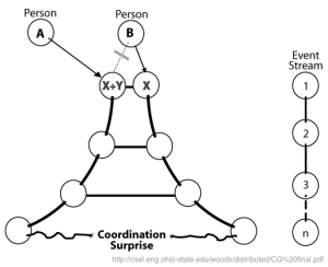
But as much as I love this book, I just have to bring up this chart that’s in it:

This is the Hindenburg of charts. I can’t even, and it’s not for lack of trying to even. Being horrified by the awfulness of this chart is left as an exercise for the reader, but don’t hold me responsible if this chart gives you ebola.
But despite the utter contempt I feel for that chart, I think the point it’s trying to make is very interesting. So let’s talk about highways.
Highways!
Highways need to be able to get many many people into the city in the morning and out of the city in the evening. So when civil engineers design highways, one of their main concerns is throughput, measured in cars per hour.
Average throughput can be measured in a very straightforward way. First, you figure out the average speed, in miles per hour, of the cars on the highway. The cars are all traveling different speeds depending on what lane they’re in, how old they are, etc. But you don’t care about all that variation: you just need the average.
The other thing you need to calculate is the density of cars on the highway, measured in cars per mile. You take a given length of highway, and you count how many cars are on it, then you repeat. Ta-da! Average car density.
Then you do some math:

Easy peasy. But let’s think about what that means. Here’s a super interesting graph of average car speed versus average car speed:

Stay with me. Here’s a graph of average car density versus average car speed:

This makes sense, right? Cars tend to pack together at low speed. That’s called a bumper-to-bumper traffic jam. And when they’re going fast, cars tend to spread out because they need more time to hit the brakes if there’s a problem.
So, going back to our equation, what shape do we get when we multiply a linear equation by another linear equation? That’s right: we get a parabola:

That right there is the throughput curve for the highway (which in the real world isn’t quite so symmetric, but has roughly the same properties). On the left hand side, throughput is low because traffic is stopped in a bumper-to-bumper jam. On the right hand side, throughput is low too: the cars that are on the highway are able to go very fast, but there aren’t enough of them to raise the throughput appreciably.
So already we can pick up a very important lesson: Faster movement does not equate to higher throughput. Up to a point, faster average car speed improves throughput. Then you get up toward the peak of the parabola and it starts having less and less effect. And then you get past the peak, and throughput actually goes down as you increase speed. Very interesting.
Congestion
Now, looking at that throughput curve, you might be tempted to run your highway at the very top, where the highest throughput is. If you can get cars traveling the right average speed, you can maximize throughput thereby minimizing rush hour duration. Sounds great, right?
Well, not so fast. Suppose you’re operating right at the peak, throughput coming out the wazoo. What happens if a couple more cars get on the highway? The traffic’s denser now, so cars have to slow down to accommodate that density. The average speed is therefore reduced, which means we’re now a bit left of our throughput peak. So throughput has been reduced, but cars are still arriving at the same rate, so that’s gonna increase density some more.

This is congestion collapse: a sharp, catastrophic drop in throughput that leads to a traffic jam. It can happen in any queueing system where there’s feedback between throughput and processing speed. It’s why traffic jams tend to start and end all at once rather than gradually appearing and disappearing.
The optimal place for a highway to be is just a little to the right of the throughput peak. This doesn’t hurt throughput much because the curve is pretty flat near the top, but it keeps us away from the dangerous positive feedback loop.
So what does all this have to do with product development workflow?
Kanban Boards Are Just Like Highways
On a kanban board, tickets move from left to right as we make progress on them. If we had a kanban board where tickets moved continuously rather than in discrete steps, we could measure the average speed of tickets on our board in inches per day (or, if we were using the metric system, centimeters per kilosecond):
And we could also measure the density of tickets just like we measured the density of cars, by dividing the board into inch-wide slices and counting the tickets per inch:
Let’s see how seriously we can abuse the analogy between this continuous kanban board and a highway:
- Tickets arrive in our queue at random intervals, just as cars pull onto a highway at random intervals.
- Tickets “travel” at random speeds (in inches/day) because we’re never quite sure how long a given task is going to take. This is just like how cars travel at random speeds (in miles per hour)
- Tickets travel more slowly when there are many tickets to do (because of context switching, interdependencies, blocked resources, etc.), just as cars travel more slowly when they’re packed more densely onto the highway.
- Tickets travel more quickly when there are fewer tickets to do, just as cars travel more quickly when the road ahead of them is open.
There are similarities enough that we can readily mine traffic engineering patterns for help dealing with ticket queues. We end up with a very familiar throughput curve for our kanban board:
And just like with highway traffic, we run the risk of congestion collapse if we stray too close to the left-hand side of this curve. Since kanban boards generally have a limit on the number of tickets in progress, however, our congestion won’t manifest as a board densely packed with tickets. Rather, it will take the form of very long queues of work waiting to start. This is just as bad: longer queues mean longer wait times for incoming work, and long queues don’t go away without a direct effort to smash them.
What we can learn from real-world queues
A kanban board is a queueing system like any other, and the laws of queueing theory are incredibly general in their applicability. So we can learn a lot about managing ticket throughput by looking at the ways in which other queueing systems have been optimized.
Measure your system’s attributes
First off: you need metrics. Use automation to measure and graph, at the very least,
- Number of tickets in queue (waiting to start work)
- Number of tickets in progress
- Number of tickets completed per day (or week)
Productivity metrics smell bad to a lot of people, and I think that’s because they’re so often used by incompetent managers as “proof” that employees could be pulling more weight. But these metrics can be invaluable if you understand the theory that they fit into. You can’t improve without measuring.
Control occupancy to sustain throughput
As we’ve seen, when there are too many tickets in the system, completion times suffer in a self-reinforcing way. If we’re to avoid that, we need to control the number of tickets not just in progress, but occupying the system as a whole. This includes queued tickets.
In some cities (Minneapolis and Los Angeles, for example), highway occupancy is controlled during rush hour by traffic lights on the on-ramp. The light flashes green to let a single car at a time onto the highway, and the frequency at which that happens can be tuned to the current density of traffic. It’s a safeguard against an abrupt increase in density shoving throughput over the peak into congestion collapse.
But how can we control the total occupancy of our ticketing system when tickets arrive at random?
Don’t let long queues linger
If you’re monitoring your queue length, you’ll be able to see when there’s a sharp spike in incoming tickets. When that happens, you need to address it immediately.
For every item in a queue, the average wait time for all work in the system goes up. Very long queues cause very long wait times. And long queues don’t go away by themselves: if tickets are arriving at random intervals, then a long queue is just as likely to grow as it is to shrink.
One way to address a long queue is to provision a bit more capacity as soon as you see the queue forming. Think about supermarkets. When checkout lines are getting a bit too long, the manager will staff one or two extra lanes. All it takes is enough capacity to get the queues back down to normal – it’s not necessary to eliminate them altogether – and then those employees can leave the register and go back to whatever they were doing before.
The other way to address a long queue is to slash requirements. When you see a long queue of tickets forming, spend some time going through it and asking questions like
- Can this ticket be assigned to a different team?
- Can this feature go into a later release?
- Are there any duplicates?
- Can we get increased efficiency by merging any of these tickets into one? (e.g. through automation or reduced context switching)
If you can shave down your queue by eliminating some unnecessary work, your system’s wait times will improve and the required capacity to mop up the queue will be lower.
Provide forecasts of expected wait time
At Disney World, they tell you how long the wait will be for each ride. Do you think they do this because it’s a fun little bit of data? Of course not. It helps them break the feedback loop of congestion.
When the wait for Space Mountain is 15 minutes, you don’t think twice. But when the wait is an hour, you might say to yourself “Eh, maybe I’ll go get lunch now and see if the line’s shorter later.” So these wait time forecasts are a very elegant way to cut down on incoming traffic when occupancy is high. Just like those traffic lights on highway on-ramps.
Why not use Little’s law to make your own forecasts of expected ticket wait time? If you’re tracking the occupancy of your system (including queued tickets) and the average processing rate (in tickets completed per day), it’s just:

If you display this forecast in a public place, like the home page for your JIRA project, people will think twice when they’re about to submit a ticket. They might say to themselves “If it’s gonna take that many days, I might as well do this task myself” or “The information I’m asking for won’t be useful a week from now, so I guess there’s no point filing this ticket.”
Forecasts like this allow you to shed incoming ticket load when queues are high without having to tell stakeholders “no.”
Queues are everywhere
If you learn a little bit about queueing theory, you’ll see queues everywhere you look. It’s a great lens for solving problems and understanding the world. Try it out.