I couldn’t be prouder of “Queueing Theory on a Cocktail Napkin,” this lecture I gave at Antithesis in DC on June 10.
When I started to apply just a little queueing theory, it absolutely revolutionized my practice. If you’re responsible for the health of a software service, watch this talk.
Owning a production Postgres database is never boring.
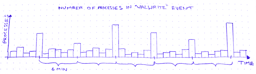
The other day, I’m looking for trouble (as I am wont to do), and I notice this weird curve in the production database metrics:
So we’ve got these spikes in WALWrite: the number of processes waiting to write to the write-ahead log (or “WAL”). The write-ahead log is written serially, so sometimes there’s contention for the mutex that lets you write to it. A queue forms.
But why does WALWrite spike periodically, every 6 minutes? Is this some cron job run amok? (*/6 * * * *? But then they’d only be 4 minutes apart at the hour boundaries…) Does a customer do some API request that updates a ton of records? Do I need to worry about this getting worse?
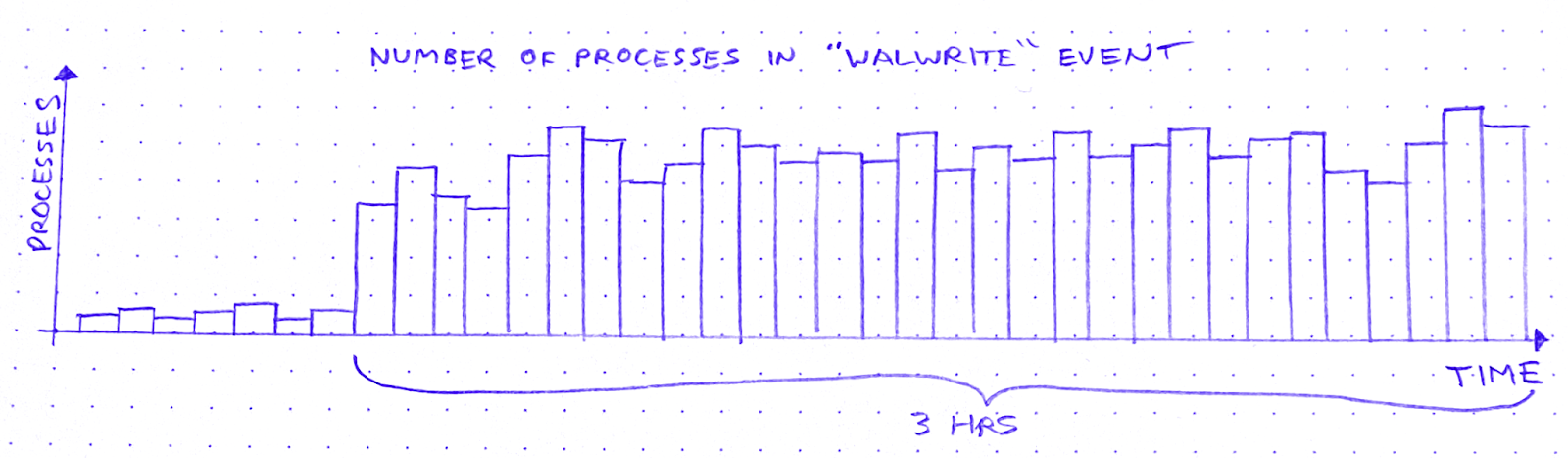
So I zoom out to see when the WALWrite spikes started:
It started about 3 hours ago. Okay: what else started about 3 hours ago?
I scroll around looking at the database graphs. After about 15 minutes of highly scientific squinting and head-tilting, I’ve got two more graphs on my screen. The first is “Max transaction duration.” That is: the age of the oldest open transaction.
This is definitely related. It shares that 6-minute period, and the sawtooth pattern also started 3 hours ago. Great.
After a bit of digging and a brief Slack conversation, I know the reason for this sawtooth pattern. There’s an ongoing backfill into BigQuery via Datastream. As far as I can tell, what a Datastream backfill does, is it starts a transaction and then uses a cursor to page through the rows of the table. Something like:
BEGIN;
DECLARE curs CURSOR FOR SELECT * FROM table OFFSET ?;
OPEN curs;
FETCH FORWARD ? FROM curs INTO ?;
FETCH FORWARD ? FROM curs INTO ?;
/* ~6 minutes later */
ROLLBACK;
After about 6 minutes the transaction closes and a new transaction begins, with a new offset. Repeat until table is backfilled.
The other new graph is “pages dirtied” by a particular query:
Now I don’t know what “pages dirtied” means. I look up “dirty page” on Urban Dictionary, but it’s a miss. So I resort to Googling around for a while. I eventually land on this Cybertec blog post (there’s always a Cybertec post. God bless ’em), which demystifies shared buffers for me.
When Postgres needs to write to a page, it:
Writes the change to the WAL
Writes the change to a buffer, marking the buffer as dirty in the process
Then a process called the background writer comes along at some point later and writes the dirty buffer to disk. Great! So that’s what “pages dirtied” means.
Except – and this is wild – the particular query whose “pages dirtied” rate is shown in the graph above is, SELECT * FROM foo WHERE id = ?. Yes you read that right: SELECT. Now I’m no SQL expert, but I thought SELECT (absent a FOR clause) was a read-only operation. Right? So what’s this about writing?
In fact, come to think of it, the sawtooth workload from before – the Datastream backfill – was also a read-only workload. So, good news and bad news. The good news is I’ve identified 2 workloads that correlate closely to the WALWrite spikes I’m trying to explain. The bad news is: they’re both read-only workloads.
At this point I need a walk, so I put on my hat and coat and I stomp through slush to the coffee shop. I feel flummoxed, and I try to think about literally anything else – Cyberpunk 2077… the French Revolution… what I’m gonna make for dinner. Anything but Postgres.
So, a few minutes minutes later, I’m waiting in line at a coffee shop, reading Postgres StackOverflow posts on my phone. And I find this one. Cybertec again! These guys are everywhere. What I learn from this post is revelatory: SELECT queries in Postgres are not read-only. True, a SELECT can’t modify rows. But it can sure as hell modify tuples!
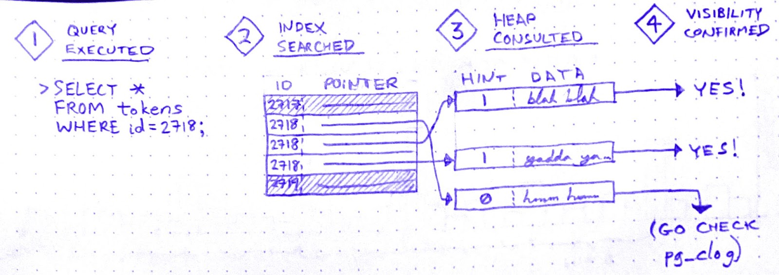
A tuple is basically a version of a row. When you UPDATE (or DELETE) a row, Postgres doesn’t just update the data in place. It creates a new tuple with the new data and adds that tuple to the heap. It also adds entries to any relevant indexes.
There is no “row” in the heap. There are only tuples. A SELECT query doesn’t just “fetch” a row. It fetches some number of tuples, determines which tuple is visible to the present transaction, and uses that tuple’s data to construct a row.
In order to make that visibility determination, Postgres needs to know, for each tuple fetched, whether the transaction that wrote that tuple has ended. It can determine this by referring to the commit log (pg_clog), but that involves disk reads, so it’s not very fast. Wouldn’t it be great if somehow we could cache the result of that pg_clog lookup so that subsequent queries can skip it?
Enter hint bits. When a SELECT checks pg_clog and determines that the transaction that wrote a tuple is closed, it sets a bit on that tuple. A “hint bit.” This way, subsequent SELECTs that fetch the same tuple won’t have to consult pg_clog.
So it’s an optimization. But, if you’ve been paying attention, you now see why SELECTs in Postgres aren’t read-only: Setting a hint bit is a write. It dirties the page.
Aha! I’m starting to get a hypothesis here:
Datastream starts a transaction in order to SELECT * FROM foo
While the Datastream transaction is open, many foo rows are SELECTed and UPDATEd by other, concurrent transactions.
Therefore, while the Datastream transaction is open, many of the concurrent SELECTs on foo must fetch multiple tuples per row. Whenever they do, they encounter tuples written by the Datastream transaction
Datastream ends its transaction.
All subsequent SELECTs that encounter tuples written by the Datastream transaction will now update the hint bits for those tuples after seeing in pg_clog that the transaction is closed.
But it doesn’t quite hang together yet. I still see two major cracks in this hypothesis:
(a) In (3): why has the Datastream transaction created tuples? That’s weird, right?
When recovering from a crash, Postgres starts from a checkpoint: a WAL entry representing an instant at which all data is up to date on disk. Then it replays all subsequent WAL changes against the data pages on disk. In order for this to work, the pages on disk must be internally consistent.
How could a page become internally inconsistent, you say? Torn writes. That’s when part of the page is written to disk, but before the next write() call can finish writing the page to disk, the system crashes. If a page on disk is “torn,” crash recovery can’t proceed. That’s why Postgres has a setting called full_page_writes, which is on by default. With full_page_writes on, the first time a page is dirtied after a checkpoint, that page is written in its entirety to the WAL.
This explains why updating hint bits caused a run on the WAL. In fact, when I raise the interval between checkpoints, the WALWrite spikes disappear.
Hooray!
But what about (a)? Why would the Datastream backfill create tuples? If it doesn’t create tuples, this whole hypothesis becomes untenable.
Well, sorry to disappoint you, but I don’t know why – or even whether – the Datastream backfill creates tuples. Perhaps it doesn’t, and my hypothesis is wrong. If you have an alternative hypothesis, please comment!
Ops is like this a lot of the time. Once you get a working fix, you move on to whatever’s the next biggest source of anxiety. Sometimes you never get a fully satisfying “why.” But you can still love the chase.
I recently had the pleasure of reading anthropologist David Graeber’s 2018 book, Bullshit Jobs: A Theory. Graeber defines a bullshit job as,
a form of paid employment that is so completely pointless, unnecessary, or pernicious that even the employee cannot justify its existence even though, as part of the conditions of employment, the employee feels obliged to pretend that this is not the case.
Bullshit Jobs is dotted with harrowing testimonials from all over the corporate sphere. It opens on Kurt, who is employed by a subcontractor of a subcontractor of a subcontractor for the German military. Whenever a soldier needs to move offices, Kurt’s job is to “take [a] rental car, drive [100-500 km] to the barracks, let dispatch know that [he] arrived, fill out a form, unhook the computer, load the computer into a box, seal the box, have a guy from the logistics firm carry the box to the next room, … [unseal] the box, fill out another form, hook up the computer, call dispatch to tell them how long [he] took, get a couple of signatures, take [the] rental car back home, send dispatch a letter with all of the paperwork and then get paid.”
Then there’s Gerte, a receptionist for a publishing company, whose main responsibilities are answering the phone the 1 time a day it rang, keeping the candy dish full of mints, and winding the grandfather clock in the conference room once a week. There’s Tom, who earns £100,000 a year using postproduction trickery to whiten the teeth and highlight the hair of models in television advertisements. From homeowners association managers to call center agents to full-time photocopiers of records in the VA, the subjects of this book all report the same grave and inescapable feeling that their work is completely pointless.
Graeber sees the proliferation of bullshit jobs as a moral tragedy. Why do we insist on employing people to do unnecessary work? Work for work’s sake is wanton domination.
I found it easy to identify with many of the people interviewed in Bullshit Jobs. I’ve certainly had jobs that were permeated by bullshit. However, I’ve never worked an entirely bullshit job.
Or so I thought! Until I came to this interview with Pablo, a software developer:
Pablo: Basically, we have two kinds of jobs. One kind involves working on core technologies, solving hard and challenging problems, etc. The other one is taking a bunch of core technologies and applying some duct tape to make them work together. The former is generally seen as useful. The latter is often seen as less useful or even useless, but, in any case, much less gratifying than the first kind. The feeling is probably based on the observation that if core technologies were done properly, there would be little or no need for duct tape.
Wait a minute! That’s my job! Can it be? Is ops a bullshit job?
The duct taper
By “ops,” I designate a whole family of jobs that share the “taking a bunch of core technologies and… mak[ing] them work together” responsibility described by Pablo. These jobs have titles like System Administrator, Web Operations Engineer, Infrastructure Engineer, Performance Engineer, Site Reliability Engineer, Platform Engineer, and DevOps Engineer. Although these jobs vary in focus, they all carry this operational responsibility, which Graeber takes as evidence that these are duct taper jobs.
A “duct taper” is a role that only exists to solve a problem that ought not to exist in the first place. Graeber cites many examples:
“I worked as a programmer for a travel company. Some poor person’s job was to receive updated plane timetables via email several times a week and copy them by hand into Excel.”
“My job was to transfer information about the state’s oil wells into a different set of notebooks than they were currently in.”
“My day consisted of photocopying veterans’ health records for seven and a half hours a day. Workers were told time and again that it was too costly to buy the machines for digitizing.”
“I was given one responsibility: watching an in-box that received emails in a certain form from employees in the company asking for tech help, and copy and paste it into a different form.”
These are all very clear cases. But if ops is one of these duct taper jobs, then what’s the corresponding “problem that ought not to exist in the first place?” According to Pablo, it’s the fact that open source technologies are “unfinished,” “lacking quality,” and have “a lot of rough edges.” If, instead, companies were working with finished, high-quality components, then there would be no need for the duct tapers. So the theory goes.
On what grounds can we object to this characterization? Certainly not on the grounds that open source software doesn’t have rough edges. It most certainly does. One could perhaps take issue with the idea that if the core technologies underlying our software stacks were built with paid labor rather than unpaid labor, they’d be more “finished.” But I won’t.
Instead, I want to take aim at a misconception that I think Pablo shares with many, many people in the software industry. Namely, the idea that if a software system is built correctly, it will work. Or, equivalently: if a software system doesn’t work, then it wasn’t built correctly.
Why ops is necessary
If you work in ops, you no doubt recognize this attitude. It’s been described in countless aspects, from the venerable old “throwing releases over the wall” metaphor to the shiny new Platform Engineering book (Fournier & Nowland, 2024):
Operational discipline, by which we mean a focus on carrying out operational practices on a routine basis, is an area that it’s easy for those with an application software development background to overlook (or worse, roll their eyes at). Some folks think the only reason people have to focus so hard on operational practices is that they didn’t build their APIs right in the first place.
… [I]t is difficult to operate a system whose major functionality predominantly comes from someone else’s code – be it an OSS or vendor system, or some other in-house system. This adds a level of complexity in that unknown operational problems (the “unknown unknowns”) are a constant threat, and the only way to manage that threat is with a discipline that seeks to understand and address all anomalies early, before they cause acute pain.
As soon as software leaves the realm of pure abstraction and enters into the service of real-world needs, it ceases to be “just software.” It becomes part of a complex system: one that includes third party platforms, multi-tenant networks, customers, adversaries, laws, and macroeconomic phenomena. The question of whether the software is built correctly may be the overriding consideration in the mind of a software developer, but it’s only a small matter compared to the myriad sociotechnical forces that determine a production system’s behavior.
Ops, in all its forms, seeks to address the challenges brought on by software’s transition from pure abstraction to engine of value. While software developers like Pablo see these challenges as incidental and indicative of shortcomings in the core technologies, they are in fact fundamental and irreducible. They’re a consequence of the ever-present gulf between the developer’s theory and the messy complexity of the world.
Operations entails constant negotiation between these two spheres: the abstract sphere of software, and the much larger, more complex sociotechnical sphere. This negotiation takes many forms:
Reorganizing the connections between subsystems
Probing the system for unexpected failure modes
Building telemetry to monitor the system’s behavior
Identifying anomalies and interpreting them
Recovering from system failures
Learning from system failures in order to improve reliability
Much of this activity looks, to an outside observer, like fixing mistakes in the design of the infrastructure. But that’s only because, when discrepancies between software assumptions and real-world behavior inevitably accumulate, they tend to accumulate along boundaries with the outside world. Which is where ops happens.
Bullshit can take many forms
Now, do I claim that ops jobs are never bullshit jobs? Of course not. There are many ways for an ops job to be partly or entirely bullshit:
You can be bad at the job, so that your work produces no value.
You can be lazy, and survive by camouflaging your low output against the natural ineffectiveness of a large hierarchical organization.
You can be effective at the job, but work for a company that produces no value.
You can work on a product that doesn’t have enough traffic to cause significant operational problems.
You can get roped into a compliance role.
Your work can be so constrained by bureaucratic box-ticking that it loses meaning.
You can just feel, in your soul, for reasons you can’t articulate, that your job is bullshit.
But most of these circumstances can apply just as easily to software dev jobs.
Only you can decide whether and to what extent you have a bullshit job. To do this, you must critically evaluate your work, the context of your work, and your feelings about your work. It’s a worthwhile exercise, regardless of where it leads.
Maybe your job is bullshit, maybe not. Just don’t take Pablo’s word for it.
Ask an engineering leader about their incident response protocol and they’ll tell you about their severity scale. “The first thing we do is we assign a severity to the incident,” they’ll say, “so the right people will get notified.”
And this is sensible. In order to figure out whom to get involved, decision makers need to know how bad the problem is. If the problem is trivial, a small response will do, and most people can get on with their day. If it’s severe, it’s all hands on deck.
Severity correlates (or at least, it’s easy to imagine it correlating) to financial impact. This makes a SEV scale appealing to management: it takes production incidents, which are so complex as to defy tidy categorization on any dimension, and helps make them legible.
A typical SEV scale looks like this:
SEV-3: Impact limited to internal systems.
SEV-2: Non-customer-facing problem in production.
SEV-1: Service degradation with limited impact in production.
SEV-0: Widespread production outage. All hands on deck!
But when you’re organizing an incident response, is severity really what matters?
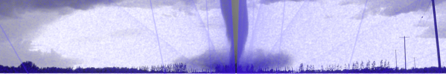
The Finger of God
SEV scales are rather like the Fujita Scale, which you may recall from the American film masterpiece Twister (1996). The Fujita Scale was invented in 1971 by Ted Fujita (seen here with Whoosh, a miniature tornado he rescued from tornado poachers and raised as his own).
The Fujita scale classifies tornados according to the amount of damage they cause to human-built structures and vegetation:
F0
Light damage
Broken windows; minor roof damage; tree branches broken off.
F1
Moderate damage
Cars pushed off road; major roof damage; significant damage to mobile homes
F2
Significant damage
Roof loss; collapse of exterior walls; vehicles lifted off ground; large numbers of trees uprooted
F3
Severe damage
A few parts of buildings left standing; train cars overturned; total loss of vegetation
F4
Devastating damage
Homes reduced to debris; trains lifted off ground and turned into projectiles
F5
Incredible damage
Well-anchored homes lifted into the air and obliterated; steel-reinforced structures leveled; “Incredible phenomena can and will occur”
Or, more colorfully,
BILL: It’s the Fujita scale. It measures a tornado’s intensity by how much it eats. MELISSA: Eats? BILL: Destroys. LAURENCE: That one we encountered back there was a strong F2, possibly an F3. BELTZER: Maybe we’ll see some 4’s. HAYNES: That would be sweet! BILL: 4 is good. 4 will relocate your house very efficiently. MELISSA: Is there an F5? (Silence.) MELISSA: What would that be like? JASON: The Finger of God.
Fujita scores are not assigned at the moment a tornado is born, nor at the moment it is observed, nor yet the moment it’s reported to the National Weather Service. They’re assigned only after the damage has been assessed. During this assessment, many tools may be brought to bear, including weather radar data, media reports, witness testimony, and expert elicitation. It can take quite a while. It may even be inconclusive: the Enhanced Fujita scale has a special “unknown” score for tornados, which is used for storms that happen to cross an area devoid of buildings or vegetation to “eat.” No matter how immensely powerful a tornado may be, if it causes no surveyable damage, its score is unknown.
Is severity even the point?
In many cases, when we’re just beginning to respond to a software incident, we don’t yet know how bad a problem we’re dealing with. We can try to use the evidence at hand to hazard a guess, but the evidence at hand is likely to be scant, ambiguous, and divorced from context. (I’m by no means the first to notice these issues with SEV scales – see Fred Hebert’s Against Incident Severities and in Favor of Incident Types for an excellent take.)
Maybe all we have is a handful of support tickets. A handful of support tickets could imply a small hiccup, or it could point to the start of a major issue. We don’t know yet.
Or the evidence might be a single alert about a spike in error rate. Are the errors all for a single customer? What’s the user’s experience? What’s a normal error rate?
This uncertainty makes it quite hard to assign an accurate incident severity – at least, without doing additional, time-consuming research. Ultimately, though, what incident response calls for is not a judgement of severity. It’s a judgement of complexity.
The Incident Command System, employed by disaster response agencies such as FEMA and the DHS, provides an illustration of complexity-based scoring. It defines a range of incident types:
Incident type
Complexity
Examples
Type 5
Up to 6 personnel; no written action plan required
Vehicle fire; injured person; traffic stop
Type 4
“Task Force” or “Strike team” required; multiple kinds of resources required
Hazmat spill on a roadway; large commercial fire
Type 3
Command staff positions filled; incident typically extends into multiple shifts; may require an incident base
Tornado damage to small section of city; detonation of a large explosive device; water main break
Type 2
Resources may need to remain on scene several weeks; multiple facilities required; complex aviation operations may be involved
Railroad car hazmat leak requiring multi-day evacuation; wildfire in a populated area; river flooding affecting an entire town
Type 1
Numerous facilities and resource types required; coordination between federal assets and NGO responders; 1000 or more responders
Pandemic; Category 4 hurricane; large wind-driven wildfire threatening an entire city
Complexity-based classification has a key advantage over that based on impact. Namely: by the time you’ve thought enough to know how complex a response you need, you already have the beginning of a plan. In other words, whereas the impact-based Fujita system is suited to analysis, the complexity-based ICS types are suited to action.
A complexity scale for software incidents
Impact-based systems, like SEV scores, do little to support responders at incident time. A complexity-based system is far better. Here’s an example of a complexity-based system for software incidents:
Complexity
Example
C-1
A handful of engineers from a single team. No handoffs.
Disk space is filling up on a log server
C-2
Coordination between teams and/or across shifts. Customer support may be involved.
Out-of-control database queries causing a performance degradation for some customers
C-3
Coordination among 3 or more teams. Customer-facing status posts may be called for. Deploys may be paused.
Outage of account-administrative functions. Severe delay in outgoing notifications.
C-4
Sustained, intense coordination cutting across all engineering team boundaries. Third-party relationships activated. Executives may be involved.
Website down due to unexplained network timeouts. Cloud provider region failure.
If you’re in control of your company’s incident response policy, consider whether a severity scale is going to be helpful to responders in the moment. You might come to the conclusion that you don’t need any scale at all! But if you do need to classify ongoing incidents, would you rather use a system that asks “How bad is it?,” or one that asks “What’s our plan?”
When queues break down, they break down spectacularly. Buffer overruns! Out-of-memory crashes! Exponential latency spikes! It’s real ugly. And what’s worse, making the queue bigger never makes the problems go away. It always manages to fill up again.
If 4 of your last 5 incidents were caused by problems with a queue, then it’s natural to want to remove that queue from your architecture. But you can’t. Queues are not just architectural widgets that you can insert into your architecture wherever they’re needed. Queues are spontaneously occurring phenomena, just like a waterfall or a thunderstorm.
A queue will form whenever there are more entities trying to access a resource than the resource can satisfy concurrently. Queues take many different forms:
People waiting in line to buy tickets to a play
Airplanes sitting at their gates for permission to taxi to the runway
The national waiting list for heart transplants
Jira tickets in a development team’s backlog
I/O operations waiting for write access to a hard disk
Though they are embodied in different ways, these are all queues. A queue is simply what emerges when more people want to use a thing than can simultaneously do so.
Let me illustrate this point by seeing what happens when we try to eliminate queueing from a simple web application.
The queueing shell game
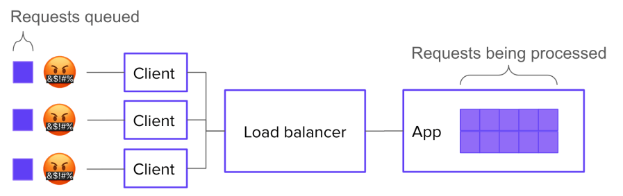
Let’s say your system has 10 servers behind a load balancer, and each server has enough resources to handle 10 concurrent requests. It follows that your overall system can handle 100 concurrent requests.
Now let’s say you have 170 requests in flight. 100 of those requests are actively being processed. What happens to the other 70?
Well, the most straightforward, job-interview-systems-design answer would be: they wait in a queue, which is implemented in the application logic.
This is great because it lets you show off your knowledge of how to implement a queue. But it’s not super realistic. Most of the time, we don’t make our applications worry about where the connections are coming from: the application just worries about serving the requests it gets. If your application simply accept()s new connections and starts working on them, then you don’t need to build a queue into it.
But that doesn’t mean there isn’t a queue! Instead of forming inside the application, a queue will form in the SYN backlog of the underlying network stack:
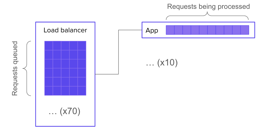
Of course, it can be advantageous instead to run your application through web server software that handles queueing for you. Then your 70 waiting requests will be queued up inside the web server:
But what if your web server doesn’t have any queueing built in? Then is there no queue? Of course not. There must be a queue, because the conditions for queue formation are still met. The queue may again take the form of a SYN backlog (but this time on the web server’s socket instead of the application’s socket). Or, it might get bumped back out to the load balancer (in which case, you’ll need a much bigger queue).
If you really do not want a queue, then you can tell your load balancer not to queue requests, and instead to just send 503 errors whenever all backends are busy. Then there’s no queue.
OR IS THERE?? Because, presumably, the requests you’re getting are coming from clients out there on the Internet that want the resource. Many of those clients, unless they’re lazy, will re-request the resource. So in effect, you’ve only moved the queue again:
Now, if you control the client logic, you’re in luck. You can explicitly tell clients not to retry. Finally, you’ve eliminated the queue.
LOL, just kidding. Because the human, your customer, still wants the resource. So what will they do? They will keep trying until they either get their data or get bored. Again, by trying to eliminate the queue, you’ve just moved it – this time, into your customers’ minds.
Requests represent intentions
If you have more requests to answer than you have space for, you will have a queue. The only way to eliminate the queue would be to eliminate the extra requests. But a request doesn’t start the moment you get a connection to your load balancer – it starts the moment your customer decides to load a resource.
I was recently delighted to be interviewed by Adam Hawkins on his podcast Small Batches. We discussed a huge variety of topics. Here is the full episode, and on that page you’ll find meticulously timestamped links to specific topics. Check out the rest of Adam’s podcast, it’s phenomenal!
“Let’s track our production errors,” they said. “We’ll harvest insights,” they said. And 3 years later, all we have to show for it is an error tracking dashboard so bloated with junk that it makes us sick to look at.
When error tracking is working, engineers engage with it regularly, scrutinizing every new error thrown. This regular engagement is what transmutes raw error data into meaning. If engagement ceases (or never gets started) then, like bull thistle in a sad old garden, noise dominates.
Of course we often don’t realize how noisy the errors have gotten until things are already well out of hand. After all, we’ve got shit to do. Deadlines to hit. By the time we decide to get serious about error management, a huge, impenetrable, meaningless backlog of errors has already accumulated. I call this stuff slag.
Slag is viscous. Try to dig yourself out of the heap by brute force, one error at a time, starting with the most common, and you won’t get very far. After you investigate the top 10 errors and find out that 9 of them are complete non-issues that aren’t worth fixing, the wind will drain from your sails. Investigating errors takes a lot of time, and there are still 340 to go! Wait, I just refreshed the page and there’s 348 now.
Slag engenders hopelessness, and hopelessness drives teams to declare bankruptcy on error tracking.
The reason slag engenders hopelessness is because you’d have to dig through essentially all the slag in order to get any value. But by excluding behaviors, you can create incremental value as you burn down the error list. This changes the tradeoff, making error remediation work into something that’s immediately and obviously worth doing.
The magic of excluded behaviors
Suppose you have a list of errors that your system throws in production. Sorting this list by frequency-of-error and eyeballing it, you see that it contains about:
40 kinds of network timeouts
30 different JSON parse errors
20 Nil pointer exceptions, spread across the codebase
12 Postgres deadlocks
… many more errors that are harder to lump into categories.
I would look at this list and say, “Well, deadlocks are never expected or desired, and they’re often contributing factors in larger problems… so let’s exclude deadlocks.” (Someone else, with different constraints and knowledge, might justifiably pick a different behavior to exclude.) Anyway, we pick a behavior, then we exclude it.
Here’s how you exclude a behavior:
List all the individual errors in the class to be excluded.
Burn down that list by fixing each underlying bug.
Create a (non-paging) monitor to catch regressions.
When you exclude a behavior, you get immediate incremental value. Where before there was a system that would sometimes deadlock in production, now there’s a system that is known never to deadlock in production.
This guarantee is immensely valuable. By eliminating deadlocks from the system, you block off a whole range of ways that surprising failure modes could creep into your system. This yields a direct increase in reliability.
Excluding a behavior also makes your system easier to troubleshoot! Suppose you’re hunting down a bug that manifests as sudden server process crashes in production. You might wonder if an out-of-memory condition could be to blame for this behavior. And so you might spend half a day scrolling through logs, trying to correlate OOM events with your crashes. Whereas, if you’ve excluded out-of-memory errors, then you can hop right over that whole entire rabbit hole. Haven’t been notified about any OOMs? Then there haven’t been any OOMs.
Here are some classes of behavior that you might choose to exclude:
deadlocks
out-of-memory crashes
network timeouts between load balancer and web server
503 errors
Nil-pointer exceptions
database transactions longer than 30 seconds
Go panics
It shouldn’t be hard to think of more.
Do you really have to eliminate every member of an excluded class? Can’t you make exceptions?
Sure you can make exceptions. Just make sure you document the reasoning for any exception you make.
Because another great thing you get out of excluded behaviors is a list of known vulnerabilities to failure. This list is worth its weight in gold as a tool for knowledge transfer activities, such as onboarding, planning, and architecture design.
After a while, you get kind of addicted to excluding behaviors. Each new exclusion makes your production system that much more boring.
Last month, I had the unadulterated pleasure of presenting “No Observability Without Theory” at Monitorama 2024. If you’ve never been to Monitorama, I can’t recommend it enough. I think it’s the best tech conference, period.
This talk was adapted from an old blog post of mine, but it was a blast turning it into a talk. I got to make up a bunch of nonsense medical jargon, which is one of my favorite things to do. Here are my slides, and the video is below. Enjoy!
If you’re a junior engineer at a software company, you might be required to be on call for the systems your team owns. Which means you’ll eventually be called upon to lead an incident response. And since incidents don’t care what your org chart looks like, fate may place you in charge of your seniors; even your boss!
That’s a lot of pressure, and they certainly didn’t teach you how to do it in school. You’re still just learning the ropes, and now they expect you to be in charge? During an outage? And tell more senior engineers what to do? It seems wrong and unfair.
But let your inexperience be an advantage!
Incident lead is not a technical role
The incident lead is the person accountable for keeping the response effort moving swiftly forward. That involves a wide variety of activities, of which fixing the problem only represents a subset.
Just like the leader of any team, the incident lead’s main job is to keep all the participants on the same page – in other words, to maintain common ground. It’s common ground that allows a group of individuals to work together as more than just individuals. And you don’t need to be deeply versed in the tech to do that. You just need to ask questions.
Aim to understand the problem just enough to make pretty good decisions. Your decisions don’t have to be perfectly optimal. If the primary SME says something like,
It looks like maybe the Chargeover service is borked.
and you don’t know what the Chargeover service is or why it might be borked: speak up! The Primary SME is already deep in the problem space, so they often won’t think to explain what they mean. And chances are you’re not the only one on the call who needs an explanation. As incident lead, it’s up to you to get clarity – not just for yourself, but for the whole group.
As someone who’s new to the tech stack, you’re perfectly placed to ask fundamental questions. So ask. For example, you could ask:
What makes you say the Chargeover service is borked? Did you see a graph or logs or something?
I’m not familiar with the Chargeover service – what does it do?
Do you have a hypothesis yet about why it’s borked?
You won’t need to ask a bunch of questions right in a row. Usually one or two is sufficient to jolt an SME out of “fixing mode” and into “explaining mode.” Then you can draw out enough information to build your own sufficient understanding, and in the process, the whole call will get an improved, shared understanding by listening to your conversation. It will develop common ground.
How do you know when your understanding is sufficient? That’s a job for closed-loop communication. As soon as you think you can, repeat back in your own words the following:
The symptoms
The main hypothesis that the SME is entertaining to explain the symptoms
Any other hypotheses in play
What action(s) the SME is planning to take
If you say these things and the SME says, “Yup, that’s right,” then congratulations! You’ve successfully established common ground among incident responders. You’ve done a better, more valuable job than the vast majority of incident leads (even ones who are very experienced engineers). Because you asked fundamental questions and listened.
If you’re looking to raise your incident response game, my 3-part course Leading Incidents is just what you need.
It only takes a few off-the-rails incidents in your software career to realize the importance of writing things down. That’s why so many companies’ incident response protocols define a scribe role. The scribe’s job, generally, is to take notes on everything that happens. In other words, the scribe produces an artifact of the response effort.
Scribe is a pretty simple – and therefore often dull – job. Usually, you just listen along and take a series of timestamped notes, like this:
14:56 Incident call convened. Jamie is Incident Commander
14:59 Dan is assigned as scribe
15:00 Jamie posts to status page
15:01 Jamie gets paged about a second service, possibly related
15:06 Taylor joins call, Taylor assigned as Primary Investigator
15:07 Jamie gives status update: two web servers seems to have dropped out of the cluster due to failing health checks; the health checks are failing with error connection timed out to redis-main.lan:6379
This is better than nothing. When new responders join the effort, they can read this timeline to get up to speed. And later, when it’s time to do a post-mortem, these notes can become (the first draft of) the timeline that gets reviewed.
But I teach scribes to create a very different kind of artifact: one that raises up the scribe from essentially a technical stenographer to an active and vital participant in the problem-solving effort.
The decay of understanding
As I’ve noted before on this very blog, if you want to fix a problem in a software system, you first have to build an understanding of the problem. Generally, the problems that can be solved without building understanding have already been eliminated.
Sometimes understanding seems to emerge spontaneously from the facts, like when someone deploys a change and the site goes down. But usually, incident responders have to work together to construct understanding over the course of the response effort. Often this process represents the bulk of the response team’s labor, and consequently, the bulk of the incident’s duration. What’s worse: the whole time you’re trying to build understanding, you have to fight against understanding decay.
As you respond to an incident, your understanding of the situation decays. Because:
You forget things you learned earlier.
The situation changes out from under you.
And furthermore, you’re not just trying to build your own understanding. You’re working as part of a team of responders who need to build a joint understanding in order to collaborate. Joint understanding suffers from the same sources of decay as individual understanding, along with many more sources:
Any two responders will get exposed to different facets of the problem. You’ll look at a different set of graphs, latch onto different error messages, and zoom in on different parts of a trace.
Two responders may assign different weights to the same piece of evidence. If you’re familiar with subsystem S, and you see evidence that subsystem S is malfunctioning, this will impact your mental model of the situation more heavily than it will impact that of your teammate, who is more familiar with a different part of the stack.
People continuously join and leave the response team. When a participant leaves, she takes her part of the joint understanding with her. When one joins, he needs to spend time “spinning up context” on the effort – and even then, he can at best obtain only an approximation of the understanding shared by the people already on the call.
Miscommunication is common, so even if two responders try to synchronize their understanding, their joint understanding will often end up with significant gaps.
A group’s ability to solve problems depends on joint understanding, and joint understanding decays over time. And in a high-pressure, dynamic situation (like an incident), it can decay fast. Unless a group works continuously to preserve and repair its joint understanding, this decay leads predictably to frustration, confusion, and mistakes. The center cannot hold.
There was an attempt (to preserve and repair joint understanding)
This need to preserve and repair joint understanding is the main reason that incident response demands a scribe. The scribe keeps a written artifact, which responders can refer to when they need to remember things they’ve forgotten, or resolve a disagreement about the facts of the case. This artifact also reduces the understanding decay that results from responders leaving the call, since those who newly join can get up to speed by reading it.
The usual kind of scribe artifact, a timeline of notes, is thus a method of maintaining and repairing understanding. And yet, as a tool for that purpose, consider its defects. The understanding encoded by the timeline is stored in “diff” format. Those who wish to come up to speed with the ongoing effort must, starting with their background knowledge, construct their understanding inductively.
This diff-format characteristic introduces 2 problems.
Problem 1: the amount of time that it takes to read through the timeline grows linearly with the timeline’s length. Eager new responders are encouraged to spin up on context by reading the timeline (or reading the chat backscroll, which is just another kind of timeline). But as an investigation goes on, the timeline gets longer and longer, making it more and more cumbersome to maintain joint understanding.
Problem 2 is even more serious. Because any two responders start with different background understandings, they will have a tendency to interpret the same facts differently, potentially ending up at quite different understandings. This is the Fundamental Common Ground Breakdown (link to KFBW paper), and it becomes more and more pernicious as the timeline gets longer.
Taken together, these two deficiencies mean the incident investigations that run the longest will also be the hardest to onboard new responders onto.
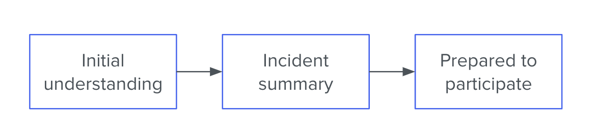
The Incident Summary
When it’s up to me, I ask the scribe to focus instead on composing an incident summary. This is a series of bullet points that lives at the top of the document. For example:
Since 09:04, users are experiencing increased page-load times. Several have filed support tickets.
At 09:04 there was a sharp increase in median web request latency, from ~40ms to ~90ms
From about 08:42 we observed a linearly increasing number of row locks in the database
We think the row locks are causing the high web request latencies
Anita is taking a closer look at the row locks to see where they’re coming from
It’s also possible that the web requests are getting slowed down for some other reason, and since they’re slow, they’re holding locks for longer. So Sigmund is investigating the request traces
or:
The hourly key-value backup job has failed 3 consecutive times (No customer-facing impact)
Starting with the run that kicked off at 18:31, the hourly backup job for the key-value store has been failing to run to completion
The job exits suddenly in the middle of copying files to cold storage. It produces no error message before crashing
Our best guess is that the job is running out of memory
Bradley is checking the server logs for OOMkill messages
The cause could also be something like a network timeout (but we think that would be logged, so maybe not)
The Incident Summary should go in its own section at the very top of the scribe document. It should be composed of 5–8 bullet points for a total of 50–150 words. It should cover (roughly in this order):
The impact of the problem (especially with regard to customer experience)
The most important symptoms that have been observed
Our leading hypothesis to explain the symptoms
What actions are being taken and by whom
At least one alternative hypothesis that hasn’t been ruled out.
Why this is so much better
As a tool for maintaining and repairing joint understanding, the Incident Summary has many advantages over the traditional timeline format.
Instead of the current understanding being encoded in “diff” format, it is available to the reader in one quick bite. This eliminates the problem of linearly-increasing context spin-up time. It also serves to place bounds on how different any two responders’ individual understandings can be – since both must coincide with the Summary.
Finally – and most importantly, if you ask me – it forces the response team to discuss their hypotheses and the limits of their certainty. This results in better plans, which means shorter incidents.
Does this mean incident timelines are deprecated?
I don’t think so. There are still many notes worth taking that won’t end up in the Incident Summary, and it can make perfect sense to keep those notes in a timeline format.
However, I do think that the scribe’s primary focus should be keeping the Incident Summary accurate and succinct. If that focus detracts from the completeness of the timeline-formatted notes further down in the document, so be it. In the presence of time pressure and a shifting knowledge base, the Summary matters more.